As of this writing, my colleague has just delivered a to demonstrate the power of Set Actions. He did a great job and I highly recommend to watch the recording. This article is a companion to that webinar, and it provides a great many links to the references and resources that unpack the detail behind each of these use cases.
Interactive is the Future
Set Actions were released with Tableau version 2018.3 and they unleash a world of new possibilities. They bring to life a dramatically increased ability for Tableau authors to tightly couple customized computation with our end users' activity.
In prior versions of Tableau, the various hacks and workarounds that were required would dramatically increase the complexity of our craft. And that complexity placed the kind of advanced analysis that is now available out of reach from most creators. So now, by lowering the barrier of entry to this kind of rich dashboard interactivity, Tableau has raised the bar for the experts to continue building upon their proficiency.
The Basics of Sets in Tableau
A SET in Tableau defines a specific criteria to partition the members of a dimension into 'in' or 'out' groups. Sets in Tableau are created on a single dimension, and they can be used across the entire data source. If the condition is true for a given record, then that record is included in the Set (“IN”). And if the criteria are not met, then the record is excluded from the Set (“OUT”). Both dimensions and measures can be used in the criteria, and Sets are treated as a BOOLEAN data type. They can be used within other calculations, and multiple Sets can be combined together to isolate the overlapping members.
An Introduction to Set Actions
Set Actions update the members of an existing Set based on a user’s interaction in the viz.
The Set Action is defined to include:
- the source sheet or sheets that the action applies to
- the target Set, whose members are updated
- the user’s behavior that will initiate the action
- and what happens when the selection is cleared
For comparison, with a Filter Action: only the values that qualify remain in the view. Everything else is filtered away. But with a Set Action: all of the data remains in the worksheet. And all of the data is still available for us as authors to utilize. Only the membership of the Set has changed.
There are so many ways that Set Actions can be used. Let’s deep-dive the use cases one by one.

USE CASES
Use the Set in a Viz
Color by a Selection
Now with Set Actions we can use a separate highlight color when a user interacts with the viz. Previously, with highlight actions, we could only highlight the color that was already applied to the viz, leaving the unselected marks opaque. Set actions now enable a more distinctive and apparent visual difference between the selected and unselected marks.


The example above was originally published in . A recent #WorkoutWednesday challenge also used Set Actions to achieve cross-highlighting (row and column) on hover. See for the steps to build that one.
Set Shape or Size by a Selection
Combining a color change together with a shape change will dual encode the user’s selection. In the example, selecting a year in one worksheet changes both the color and the shape of the marks. This is done with a single Set on Year of the Order Date.

In , a user can choose to either include or not include a region of data. Once selected, it changes the color and shape of the icon to indicate whether that region is now a part of the calculations.

Sort by a Selection
When sorting by the user’s selection, we not only sort the marks in the view but we also enable a more concise analytical examination, with a lower cognitive burden. In the sort order of a stacked bar chart is changed dynamically to put the dimension members we select on a common baseline. Without the ability to move “Lead” down as the first item in the axis, we’re unable to make a direct visual comparison by the date period. And notice: even though we’ve chosen to click & sort by a value, the other values are still available in the view (they were not filtered away).


For more on why utilizing a common baseline benefits chart comprehension, read by Steve Wexler.
Group by a Selection (Proportional Brushing)
Proportional brushing allows you to select marks in one view and, instead of filtering, show the proportion of those selected items in relation to the whole. In the post , selecting countries on the left worksheet adds the selected members to a Set (blue color). And this allows for easy visual comparison between the total value of the unselected countries (grey color). Because Set Actions don’t remove data from a view like a Filter Action does, the unselected grey countries can be used in calculations.


Compute a Selection as Percent (%) of Total
Because Set Actions allow us to perform calculations on the unselected marks (the members that are not in the Set), the ability to compute the selection as a percent of total is interactive now. In , all countries are visible on the map. Selecting, and thus filtering, on a country would remove the ability to calculate the percent of total. But with Set Actions, we can keep all the data in the view and perform a percent of total calculation to show the part to whole relationship.


Use the Set in a Set
Filter on a Related Field
This is super powerful, because now the relationships in the data drive the view. In we can see a selected team while also seeing all other teams that are related to that team. There are two Sets used to accomplish the interactivity: the first stores the selected value, while the membership of the second Set is conditional on whether a team has played against the selected team (related). The second Set is used as a filter, to remove the unrelated teams from the view. This enables the user to select a given team, and filter the view to only those other teams which have played against the selected team. for more examples of this powerful relational analysis in a business world scenario.


Group by a Related Field
Here again we can use one set inside of another to highlight relationships in the data. The product subcategories in are listed by quantity of orders. When the user selects a subcategory, the other subcategories are then divided up between those that were purchased together with the selected subcategory at checkout. This shows which product subcategories are complementary to each other at the time of sale.
Similar to the earlier example, filtering on a related field, this technique allows us to see the relationship between the “IN” members (subcategories purchased together) and the “OUT” members (subcategories not purchased together with the selected subcategory).


Use the Set in a Calculation
Filter a Measure by a Selection
Filter a Single Axis for Part to Whole
In the slope chart example , interactivity enables a part to whole analysis. The user selects a team in one worksheet (map), updating the members of a Set which sorts and filters the measure values in a destination worksheet. The analysis compares all teams’ rankings against a selected team’s ranking for each position. The difference in rank between the two is encoded not only as a shift in sort order and length of bar, but also as the mark color. Where dashboard filters would remove data from the entire worksheet, with Set Actions we can isolate that filter to only a single axis.


Filter a Single Axis for Part to Part
demonstrates Set Actions interactivity enabling “Part to Part” analysis. Each team is represented as a row down the left side of the viz and a matching list of teams is represented across the bottom. The unselected state of the viz shows an average value per position trended diagonally, increasing in value on both axes thanks to the sort. When a team is selected on the Y axis, that team’s position value is then compared to the average player value of all teams. And when a second team is selected on the X axis, those two teams are compared directly to one another. Each mark represents the value of a particular position, but according to the selected teams’ independent values. The marks above the diagonal line represent those positions that one team values more highly than the other team does in comparison.


Filter a Term in a Calculation
Difference from Summary Average
As an alternative, instead of isolating the items selected into the Set on an axis, we can also isolate the items selected into the Set inside of a calculation. demonstrates another part to whole analysis. Here each team is sorted descending by value, and a reference line represents the average value of all the teams. The user can select multiple teams (adding them into a Set). And in the lateral worksheet each individual team is then compared to an average that is calculated across selected Set. This shows, for each team in the data, their difference from the selected average.


Difference in change between Selection and Total
In , stocks are compared to each other based on their daily performance, relative to all other stocks in the data. This comparison enables the user to select a single stock and see easily whether that chosen stock is gaining on more days relative to all other stocks in the data. This viz answers whether the chosen stock is increasing “because there is something special about that stock”, or increasing only because all other stocks are also increasing.
The interactivity of the viz is enabled by a single Set on stock name. However it also requires several level of detail calculations. The line graph plots the daily average close price per stock and the quick filter controls which stocks are visible in the view. The pie graph represents whether a stock has gained on more days than it has lost or stayed equal. The histogram charts a count of days on the x axis, while the y axis (height of bar) is a count of stocks. Each worksheet is using the Set in its own distinctive way. The line graph stores the value of the chosen stock’s name. The pie uses that chosen stock to compute the portion of the days it lost to the days it gained (versus the remainder of the market). And the histogram takes it a step further by computing the days that the chosen stock gained or lost compared to the entire market.


Difference in Rank
demonstrates four types of rankings based on different sales metrics: overall, corporate, technology and city-by-state.
When a user selects a city in the Sales by City list, that city is added into a Set. The three adjacent worksheets then use that Set to determine which two cities are ranked above and below, based on that sheet’s particular criteria. This is achieved by using a combination of Set Actions (interaction and selection storage), Table Calculations (lookup to find previous and next city values, rank), Level of Detail expressions (number of cities being compared for each ranking) and sort. Bethany Lyons contributes an alternative method for by adding a parameter that lets the user control how many similar cities are returned.


Percent Difference from a Selection
In average housing prices are compared by selected outcodes (regions). These outcode are colored on the map based on their difference from the average house price of the selected outcodes Set. There are two complementary worksheets (main and legend) that each have different levels of detail visible in the view. The main worksheet has all of the outcodes as discrete regions, where the legend shows only two distinctions: selected outcodes and unselected outcodes.
Since the lowest level of detail in the main viz is the outcode region, we want to take the average of all home prices in the selected outcodes (not the average of the average home price in each outcode). Taking the average of the average in this case is analytically wrong, because we want the average of the underlying data. So level of detail calculations, used in tandem with Set Actions, allows for this interactivity. And it returns the values that are analytically correct.


Part to Part Analysis
Difference between Subsets
The dashboard compares housing pricing during different date ranges. In addition, we see how those prices trend across the entire date range available. There are two Sets that enable this interactivity, a Set for “Period 1” years and a Set for “Period 2” years.
When the user selects these date ranges, the bar chart is updated to show, on average, how the district prices have changed in comparison from “Period 1” to “Period 2”. The show the difference in big bold numbers in both percent and average price. The line graph is special because it charts not only the 12 month running average of home prices, but it also isolates the date ranges for “Period 1” and “Period 2”. This is does by calculating reference bands on both the x and y axes, which calls attention to the selection.


Apply a Computed Sort on a Selection
In , there are three sort options available via parameter: overall, selection and percent of total. The map allows the user to select individual countries (adding them into a Set). The bar chart then lists the position value for the selected countries compared to the whole. And depending upon the sort option, the list is sorted based on the computed measure.


allows the user to select bins (adding days and stocks into a Set) that represent the percent that a stock changes by day. When a bin is selected, that value is prioritized as the sort axis, and stocks that do not have days meeting the selected criteria are removed. Instead of using just the stock or the day in a Set, it is using a calculation on both to provide interactive analysis on the distribution of daily change.


Display Selected Value as Reference Lines
Drop Lines
Although Tableau Desktop has a built-in feature to display drop lines when clicking on a mark, that functionality doesn’t work on Tableau Public or Tableau Server. In , Lindsey Poulter surpasses this limitation with Set Actions and three layers of transparent worksheets. One of the layers of the viz dynamically calculates reference lines based on the selected mark. This creates a line that spans across the entire axis. However, to complete the illusion of drop lines, the line beyond the mark’s value is overlaid by a different worksheet which uses reference bands to mask the values that exceed the selected mark’s value.


Dynamic Reference Bands
Matt Chambers demonstrates in how to use a Set Action selection to draw dynamic reference bands from the minimum to the maximum values of the selected Set member. Using a combination of Sets and Table Calculations, a category can be selected (adding it into a Set). And the table calcs highlight the Window Minimum and Window Maximum values as a reference band.


This effect is also used in . Here the technique is used to select marks along the date axis and focus the calculations on those selections. The selected date range is highlighted as a reference band that persists, while allowing the user to continue to interact with the other sheets in the viz. Notice how this interaction allows you to NOT SELECT some marks within the date range, which excludes them from the subsequent calculations.
In the example you can see the same date range is highlighted, but with fewer marks. Compare the selected sales bar chart and you’ll see a difference between those marks that remain unselected, even while the date range spans across the same amount of months.


Conclusion
While very comprehensive, the examples I’ve provided here truly only scratch the surface of what is possible now with Set Actions. My aim for the post is to catalog many of the possible use cases, and link out to their references as a one-stop shop.
Please return to reference these use cases as needed. And . Interactivity in dashboard design is the future. If you need consulting help with Set Actions or Tableau, reach out to us as . And I hope these examples will bring new enthusiasm to your creation of dynamic, interactive analytics experiences with Tableau!
Word Count: 3066
References
- Ryan Gensel - Action Analytics Team
- Keith Helfrich - Action Analytics Team
- Webinar for Tableau Software - Rich interactive analytics with Tableau Set Actions, May 23, 2019
- How To: Highlight With Color Using Set Actions with Tableau, Matt Chambers, November 1, 2018
- How to create a cross highlight action in Tableau, Sean Miller, November 7, 2018
- Tableau Set Actions, Marc Reid, October 30, 2018
- Use Icons to Add and Remove Values from a Set, Lindsey Poulter, November 14, 2018
- Improved Stacked Bar Charts with Tableau Set Actions, Dorian Banutoiu, February 27, 2019
- How to take the “screaming cats” out of stacked bar and area charts, Steve Wexler, November 25, 2017
- How to do proportional highlighting with set actions in the latest Tableau beta, Andy Cotgreave, August 2, 2018
- Example 1 - Percent of Total, Bethany Lyons, November 1, 2018
- Filtering on a Related Field, Bethany Lyons, December 3, 2018
- Webinar for Tableau Software - Rich interactive analytics with Tableau Set Actions, May 23, 2019
- Market Basket Analysis - Set Actions, Bethany Lyons, December 12, 2018
- Example 3 - Difference in Rank, Bethany Lyons, November 1, 2018
- Example 4 - Part to Part, Bethany Lyons, November 1, 2018
- Example 6 - Difference from Summary Average, Bethany Lyons, November 1, 2018
- Example 8 - Change of Selection Relative to Overall Change, Bethany Lyons, November 1, 2018
- View Similarly Ranked Items Using Set Actions and Table Calcs, Lindsey Poulter, November 29, 2018
- Filter to Similar Items, Bethany Lyons
- Example 7 - Difference from Underlying Average, Bethany Lyons, November 1, 2018
- Example 5 - Range Comparisons, Bethany Lyons, November 5, 2018
- In Praise of BANs (Big-Ass Numbers), Steve Wexler, February 15, 2018
- Example 2 - Proportional Brushing, Bethany Lyons, November 1, 2018
- Sorting and Aligning on a Selection, Bethany Lyons, December 10, 2018
- Create Custom Drop Lines Using Set Actions and Transparent Worksheets, Lindsey Poulter, November 19, 2018
- How To: Dynamic Reference Band Using Set Actions with Tableau, Matt Chambers, November 13, 2018
- Set Actions - Reference Line Highlighting, Corey Jones, November 2, 2018
- Webinar for Tableau Software - Rich interactive analytics with Tableau Set Actions, May 23, 2019
- Action Analytics
For the 2016 Tableau Conference in Austin, and I have unified our previously separate work on building Twitter network graphs in Tableau.
Incorporating text analytics, our aim was to update the view at steady increments throughout the conference.
You can find our earlier pieces on Tableau Public at these links:
And here is the :
Project Wrap-Up
Chris has published his write-up about the project . For my retrospective, I will highlight aspects of the data pipeline, the tool sets, and the collaboration.
Vectorization
Various pre-compute steps were executed independently within the overall workflow for each topic:
- keyword parsing (Python)
- keyword scoring (Python)
- network coordinates generation (R)
- network centrality measurements (R)
- orchestration & data reshaping (Alteryx)
So, with 28 topics, you can imagine that I didn't want to run these five steps manually, for each topic on every data refresh! So vectorizing these individual components inside of the overarching workflow was important for automation.
Multi Disciplinary
Making use of four tools, Python > Alteryx > R > Tableau, our pipeline was rather sophisticated.
Each tool has an inherent strength, and it follows naturally that all four analytics environments had a part to play. As craftsmen, we can achieve so much more by weaving together the strengths of separate tools than we could by working in a single environment in isolation.
This was one of my greatest take-aways from the project.
It Takes a Village
My other largest take-away is the power of embracing widely diverse individuals. Chris and I were the principal actors. And yet, valuable contribution from a wide variety of individual skill sets was needed to bring this complex effort to fruition:
- Ronald Sujithan
- Python for harvesting twitter data
- Python for keywords parsing and scoring
- Chris DeMartini:
- Visual design & concept
- Hive plots in Tableau
- Dynamic parameters in Alteryx
- Bora Beran:
- Inspiration for network analysis in R
- Keith Helfrich:
- Vectorized R code for network analysis
- Network graph + etc in Tableau
- Overall data pipeline in Alteryx
- Joe Mako:
- Cartesian join for "inbound first degree"
- Understanding final granularity in Tableau
- Alteryx assist for Hive plot reshaping
- Ali Sayeed:
- Help with vectorization in Alteryx
- Pavel Mizenin:
- Vectorizing Ronald's keywords code
- Jonathan Drummey:
- Quality assurance & ideation
Weaving together this multi-contributor collaboration was the most rewarding of the project experiences!
Word Count: 396
References
- Chris DeMartini, Tableau Public, November 17, 2016
- Tableau Conference Twitter Networks, Keith Helfrich, Tableau Public
- Tableau Conference Over the Years, Chris DeMartini, Tableau Public
- #Data16 Twitter Network Project, Chris DeMartini, DataBlick, November 17, 2016
- TC16 Twitter Networks, Keith Helfrich, Tableau Public, November 17, 2016

Detailing Twitter mentions from across four years of the annual Tableau Conference, in a collection of 45 interactive network graphs, this project is published in close collaboration with . He is also presenting a curated collection of his beautiful hive plots from the same data.
You can find our two pieces on Tableau Public at these links:
Bringing It Together
My interest in the analysis of network graphs first piqued while studying in Stanford Online MOOC, . A graduate level course intensive in math and theory, it was challenging; and also left me wanting for real world application of the concepts I had learned.
Bringing together my recent studies in R, Alteryx and Tableau, this project is that application.
If public data from Twitter is perhaps relatively benign? Then consider the power of enabling visual exploration of other more highly valued network data sets. Here is a great example:
Once online, our every movement, every click, sent or received email, our every activity produces a vast amount of invisible traces. These traces, once collected, put together and analysed, can reveal our behavioral patterns, location, contacts, habits and most intimate interests. They often reveal much more than we feel comfortable sharing.
Data Pedigree
The 2015 data for this project was harvested by Ratchahan Sujithan, working for me as an intern during the weeks leading up to TC15. Ratchahan tended to the python scripts diligently, each day calling the twitter API to collect and reshape the data. As the largest Tableau conference to date and also the year with the most ample collection of tweets before and after the event, the data volume for 2015 is much larger than we have for the previous years.
The 2012 to 2014 data was rescued from Excel and Tableau Data Extract files. Qualifying as as "Red Headed Step Data", it is never-the-less very sufficient for our purposes.
Many thanks to the folks from Tableau for providing those older data sets. If you happen to have a more complete or higher quality collection of Twitter data for these years, please reach out to me?
One of four Alteryx workflows used bring together these disparate sources is shown here.
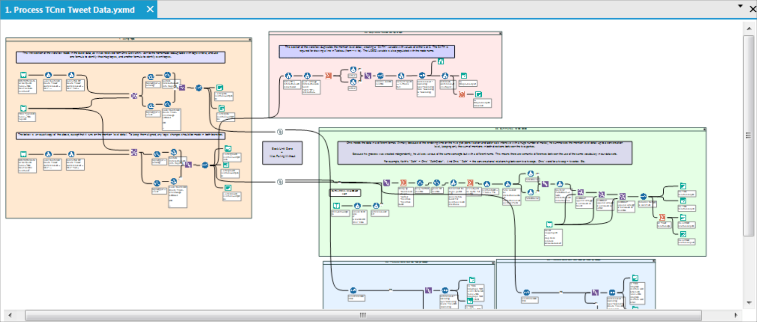
Vectorized Processing
Of principal importance to this pipeline is the ability to "vectorize" the data processing for each SubGraph. This means, it was important to build the Alteryx workflows and R scripts so that any number of SubGraphs can be processed logically, without requiring additional effort.
This vectorization is accomplished in R with only two commands:
mentionsList <- lapply(runsubset,processmentions)="" mentionsdf="" <-="" ldply(mentionslist,="" data.frame)="" <="" code="">R is a vectorized language, which is awesome. This makes it easy to "apply" a function to each object in a list of objects using a single command. And to then consolidate the resulting list back into a one data frame with the second command.
Yet the main reason to vectorize inside of R instead of making a more basic call to R from within an Alteryx batch macro is because, due to the open source licensing restrictions, each call to R from a batch macro must startup a completely new R instance. And the performance degrades very quickly.
Performance aspects aside, the main takeaway around vectorizing the process is that, with just two formula tools in Alteryx to parse out topics based on either hashtags or time boxed events, and just two lines of R code to run the commands over each of those topics: now the entire pipeline is flexible and resilient.
It can process & visualize any number of network SubGraphs end-to-end repeatably, from raw data to interactive Tableau dashboard, without making logic changes.
Network Centrality
In network analysis, a "node that is central to the network" is in some way a focal point or a main figure. The nodes with a high degree of centrality are often able to exert a greater degree of influence within that network.
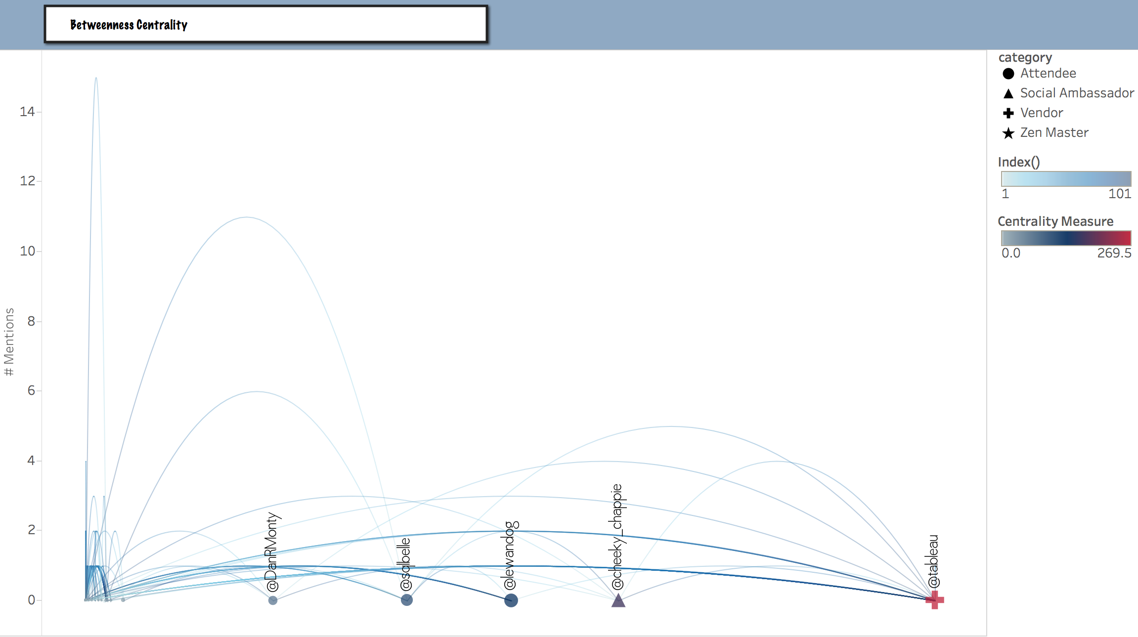
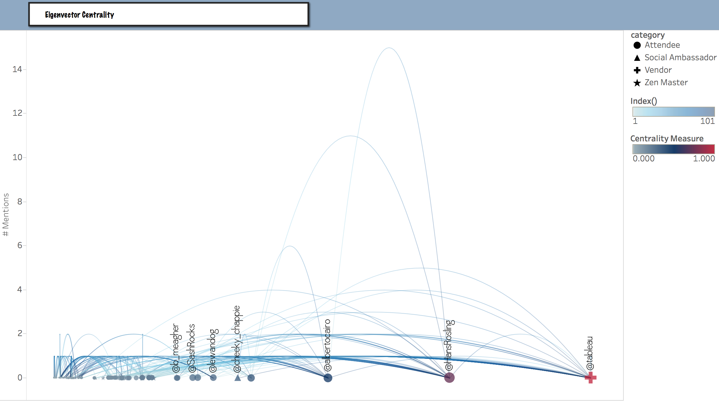
The Tableau work brings this concept of into focus by providing two alternative centrality measures for navigating, filtering, sorting, and highlighting the data.
is equal to the number of shortest paths from all vertices to all others that pass through that node. A node with high betweenness centrality has a large influence on the transfer of items or information through the network, under the assumption that item transfer follows the shortest paths. Although the “Betweenness” metric is important, it doesn't necessarily predict the ranking of members by a governing metric.
explains the degree to which a given node is connected to the most important node in the network. An “introverted” member, one with little or no “betweenness”, could in fact still be quite important due to its influence on other members who are themselves very well connected.
Recall that the concept of Eigenvector Centrality is at the heart of Google's original Page Rank algorithm. A web page that is linked to from other important web pages is, by virtue of those links, more important.
A slider in my Tableau workbook enables you to filter by Eigenvector Centrality. This can help in certain analyses by trimming away the users with a lower centrality and "zooming in" to those who are "closer to the center of influence".
When we place these two centrality measures side-by-side, for the 2014 Hans Rosling Keynote, it becomes self-evident that they are different measures, offering distinctive insights.
Betweenness Centrality
Here we see the tweeps through whom the information flows most efficiently, with the least number of hops. Notice how @hansrosling himself is not prioritized by the betweenness metric.
Eigenvector Centrality
Here we see the ranking of tweeps based upon their connectedness to other highly ranked individuals. Notice how both @albertocairo and @hansrosling are prioritized.
Navigating These Views
To navigate these views, it's best to begin with a conference year and then choose your topic of interest. As the volume of tweets has grown significantly, the ability to navigate SubGraphs by topic is vital to making this rich and dense data consumable.
After choosing a year, topic, and a centrality measure, you can then further refine your exploration with any combination of the following mechanics.
Highlight Your Tweeps
Where is Andy
Find your tweeps using the . For example, here's what it looks like when we play Where's Andy? during the TC15 Data Night Out.
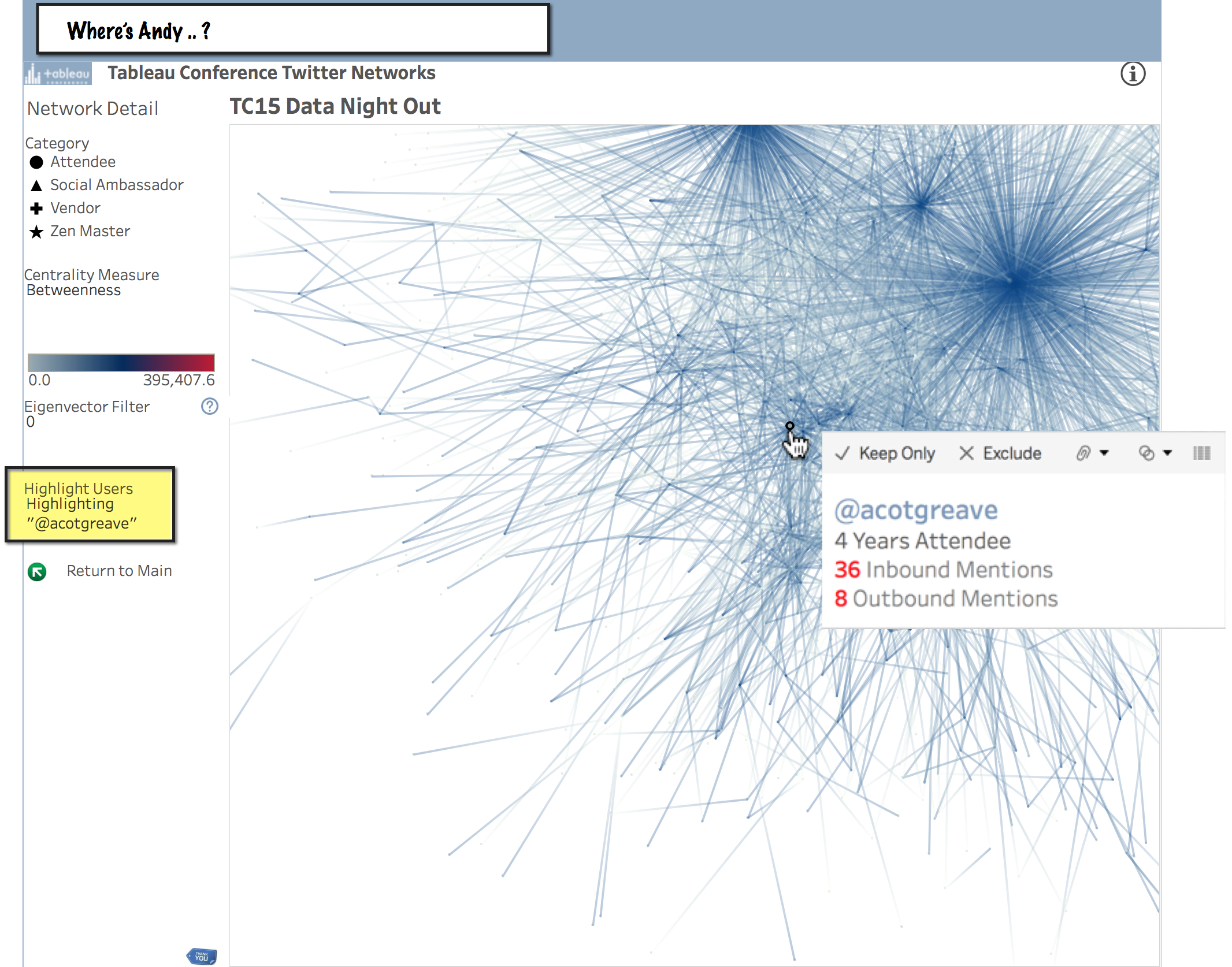
But, in an extremely dense haystack, perhaps only finding the needle is insufficient?
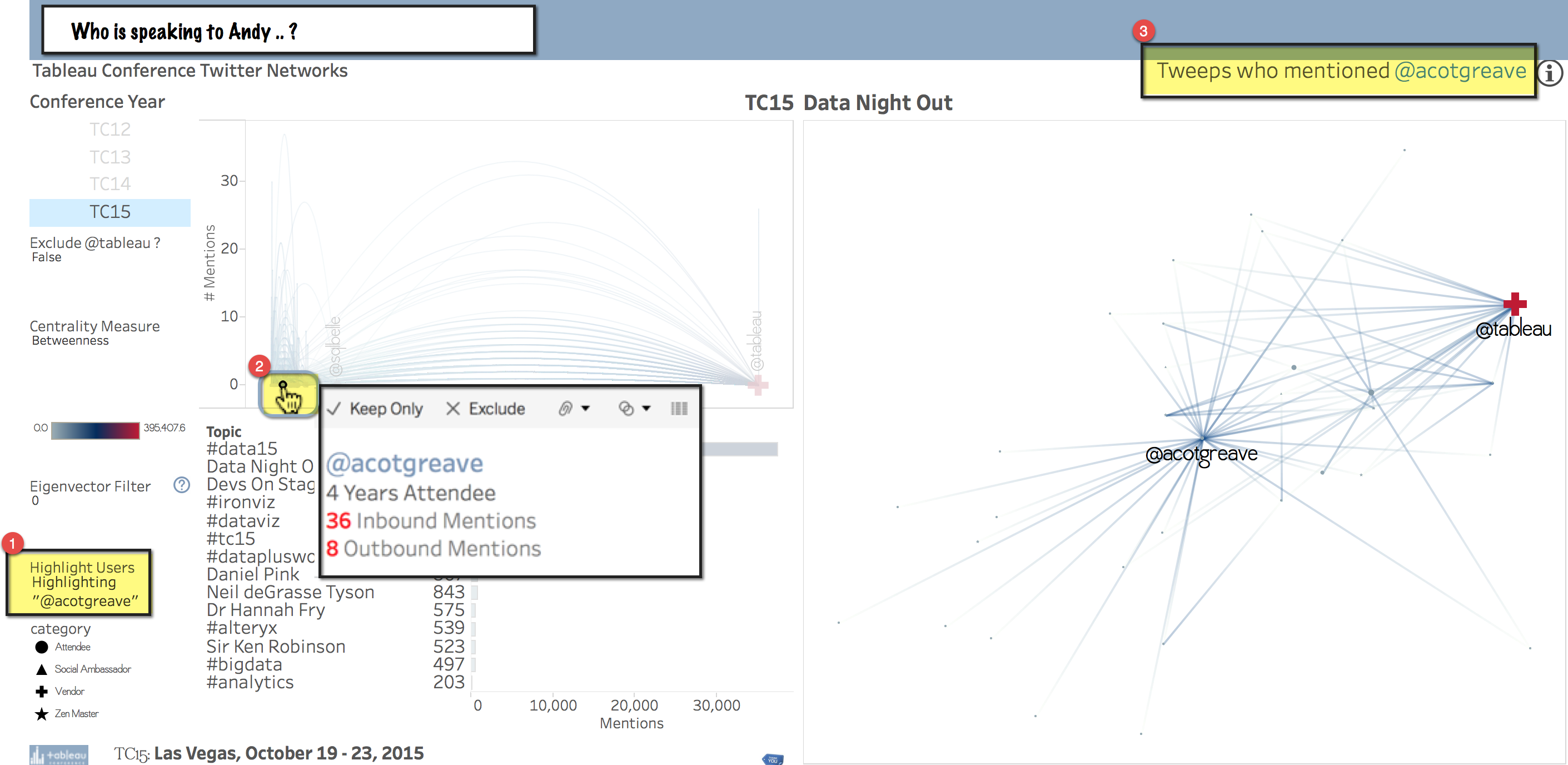
For this reason, another key feature of this project is the ability to hover or select any user in the Jump Plot and filter to that person's inbound first degree network.
This makes it possible to remove all the nodes but those involved in conversation with a specific individual. A very different question! So here's what it looks like to play the new game.
Who is Speaking to Andy?
If you would like to use this workbook for data mining, please feel free. Since the hover action is slow through the web, consider downloading the workbook to explore hands-on and locally from Tableau Desktop.
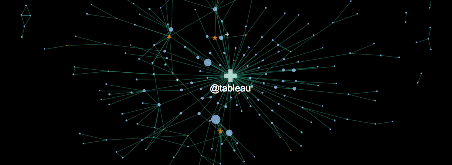
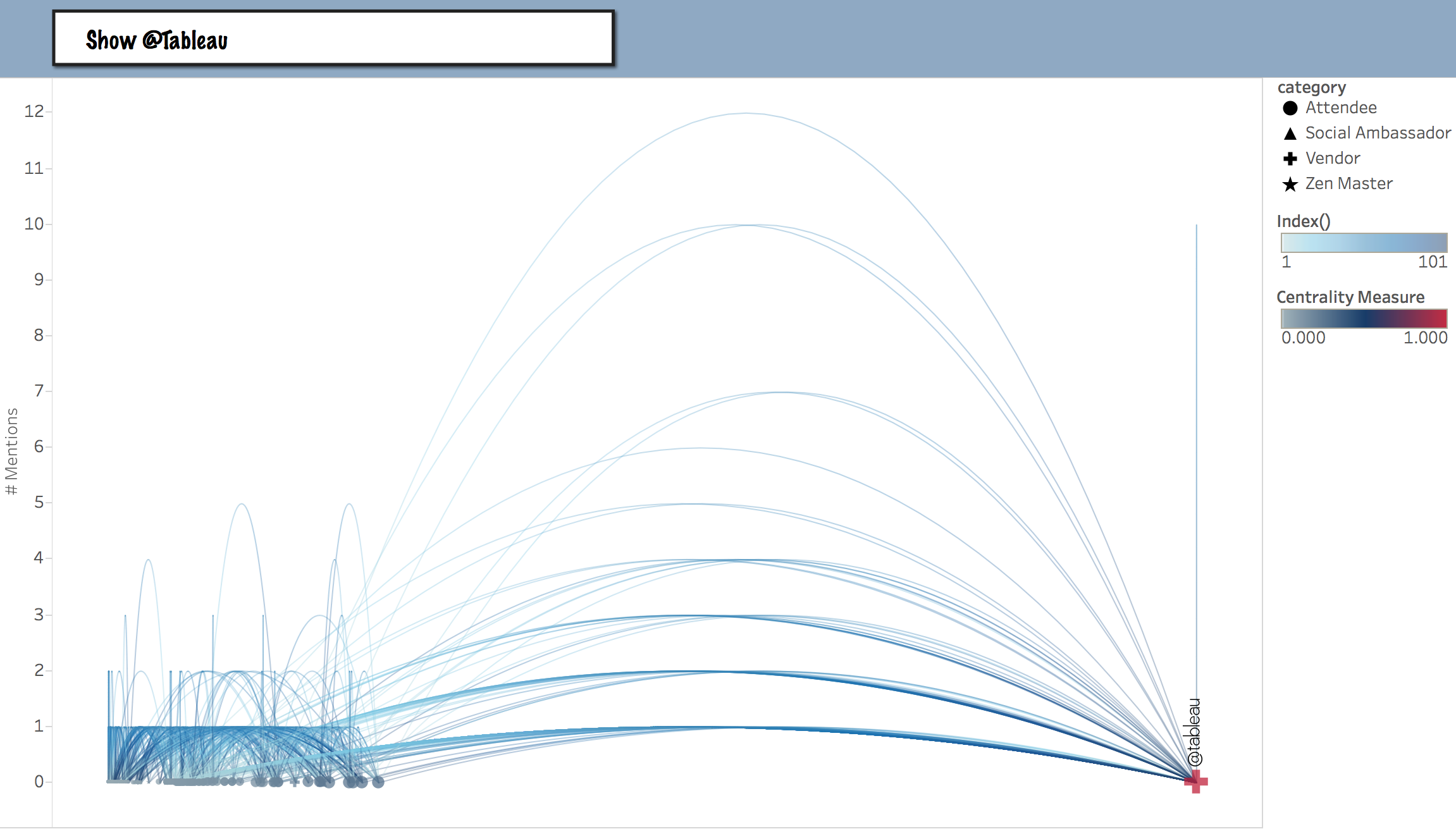
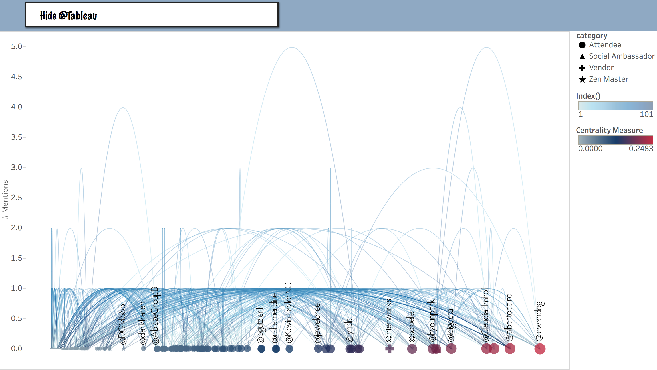
Exclude @Tableau?
An artifact of reality, the @Tableau twitter handle tends to be mentioned very frequently during the Tableau conference. And as a result of that reality, the @Tableau handle also tends to dominate the network centrality metrics.
In the image above, even using the data highlighter, notice how it can be difficult to hover your mouse exactly over @acotgreave in the Jump Plot? That's because, well, just like everybody else, he has been scrunched down into the extreme left of the betweenness centrality axis during the chaotic period of Data Night Out.
To lighten up on that scrunching effect, you might prefer to Hide @Tableau from the centrality measure Jump Plot.
Switching for this example to the TC14 Opening Keynote, here is the difference between deciding whether to show or hide @Tableau:
Show @Tableau
Hide @Tableau
Filter by Eigenvector Centrality
In a dense network, for certain analyses it can be additionally helpful to further reduce clutter by zooming into the tweeps with higher degrees of Eigenvector Centrality.
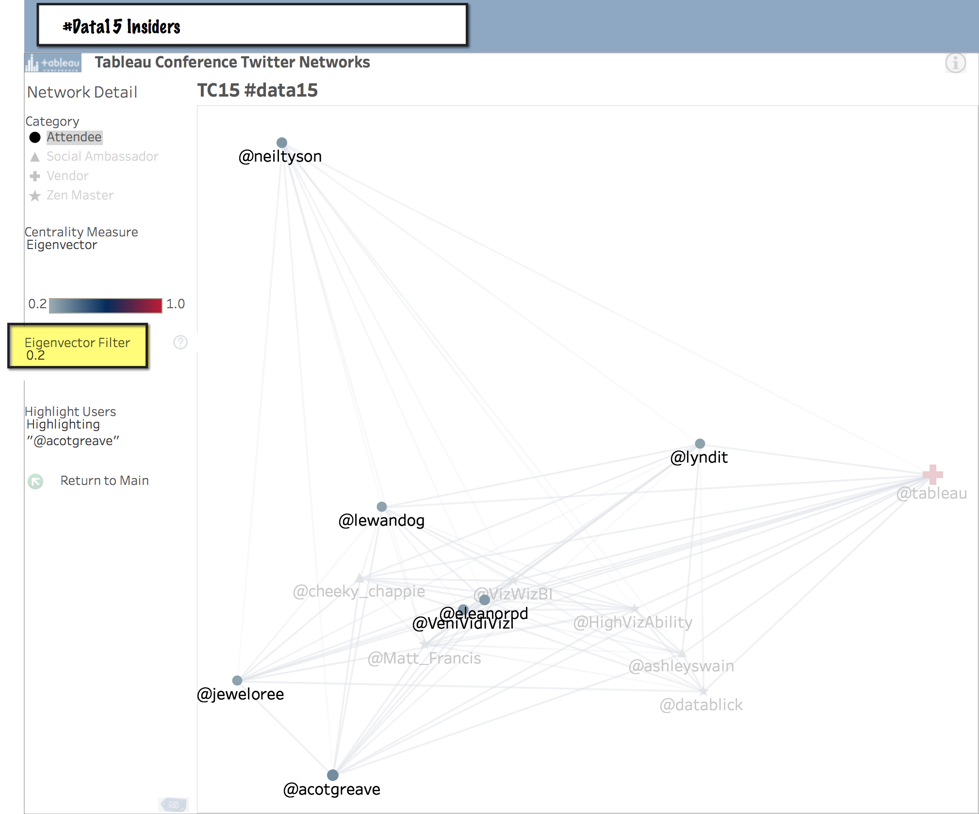
For example, in the extremely busy graph of all 37,540 mentions in the #data15 hashtag, by adjusting the Eigenvector Filter we can incrementally remove layers from the outer edges of the network, like an onion.
All of #Data15
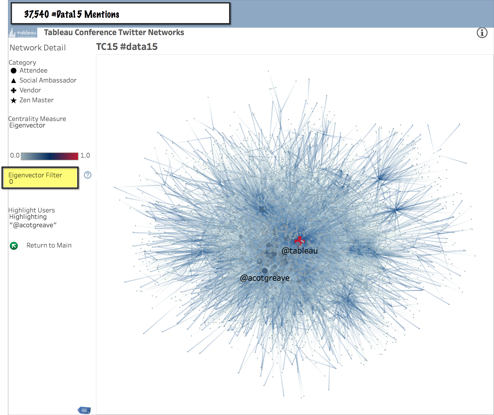
#Data15 Twitterati
Eventually we reach a core nucleus of the #data15 inner circle. Those with an Eigenvector Centrality measure above 0.2.
Of these central tweeps, two are exceptional in that they are neither a Zen Master, nor a Tableau Ambassador, nor an employee. Congratulations to Gregory Lewandowski and Lyndi Thompson, you're on the inside of the velvet rope!
Highlight by Category
As seen above, it can be additionally insightful to use the shapes legend to highlight Attendees, Vendors, Zen Masters and Tableau Ambassadors.
If you have any contributions or corrections these category assignments, please send me a note!
Pan and Zoom
Lastly from the perspective of navigation, do also make use of the View Toolbar, especially when exploring the large networks.
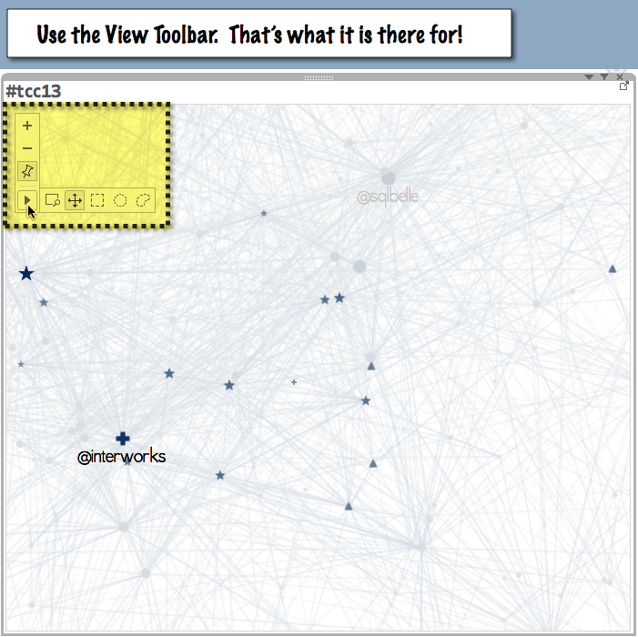
Remember, if you pin the XY coordinates to a specific location, then you should also un-pin them when you change Topics.
Data Driven Insights?
Which new insights can we glean from Network Graphs?
Beyond their inherent beauty, the power of a visual network analysis is in the relative ease with which the underlying relationships can be explored and understood.
More than satisfying a curiosity, identifying visual patterns in those relationships offers an improved understanding of the real world dynamics at play behind vast amounts of social or economic data.
If you're inspired to download the workbook & mine this rich data in greater detail, then I'm curious. Which patterns do you see? Which insights do you discover? Please send them to me. I can write them up along with my own discoveries in a future post.
Thanks and Appreciation
Working in 3 tools, the amount of effort behind project has been significant. And as is often the case, when working with data we sometimes encounter challenges that are greater than ourselves. This is where the valuable support, help & input from our friends and colleagues is ever beneficial.
Much appreciation to ! For his eternal kindness and, specifically, his assistance with adding cartesian joins to my Alteryx workflow for the richer presentation of the "inbound first degree" filter. And then, again for helping me to understand and work with the final granularity after all of the various forms of data duplication were done.
The data for 2012 - 2014 were provided by Michelle Wallace, Andy Cotgreave, and Mike Klaczynski. Jonathan Drummey was immediately responsive to our questions about conflicting URL filters. And Ali Sayeed graciously helped me to overcome a challenge in Alteryx when vectorizing the workflow.
Thank you!
Continued Collaboration
This project comes to fruition as a wonderful collaboration with . We've done our best to assist one another, coordinate efforts, and cross link with URL actions between our visualizations.
Chris has been an absolute pleasure to work with. His hive plots on this same data set are absolutely stunning in their elegance! His valuable input on my data manipulations and the presentation has been prescient. And he was super helpful with troubleshooting the jump plot.
As a result of this recent collaboration, we hope to expand further upon this Twitter work by merging our efforts during . Here is a link to Chris' write-up on his hive plots: .
Be sure to check them out!
Word Count: 1,891
References
- Chris DeMartini, Tableau Public, August 10, 2016
- Tableau Conference Twitter Networks, Keith Helfrich, Tableau Public
- Tableau Conference Over the Years, Chris DeMartini, Tableau Public
- Social and Economic Networks: Models and Analysis, Stanford Online, April 1, 2013
- Metadata Investigation: Inside Hacking Team, Share Lab Investigative Data Reporting Lab, October 29, 2015
- ‘igraph’, R Package Documentation, CRAN, June 26, 2015
- Betweenness Centrality, Wikipedia, August 9th, 2016
- Eigenvector Centrality, Wikipedia, August 9th, 2016
- Quickly Find Marks in Context with Tableau 10's New Highlighter, Amy Forstrom, Tableau.com, June 2, 2016
- Tableau Conference 2016, Tableau Software, Austin, Texas, November 7 - 11, 2016
- Joe Mako, www.joemako.com, August 10, 2016
- Jonathan Drummey, DataBlick, August 10, 2016
http://rhsd.io/2aKHiJf - Tableau Conference Over the Years, Chris DeMartini, Tableau Public
- The Tableau Conference Network, Chris DeMartini, DataBlick, August 10, 2016

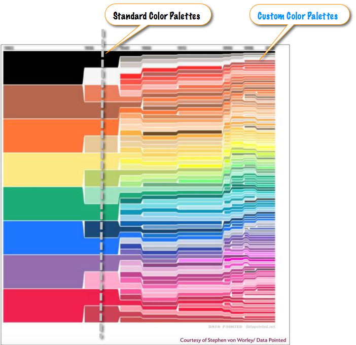
This post imbues the importance of innovation with color in data visualization, offers a variety of resources and reference materials, and encourages personal innovation with color as absolutely vital to moving your visual communication of data forward in Tableau.
Emotion and Behavior
The effective use of color is fundamental to the visual communication of data.
As our eyes take in color, they communicate with the hypothalamus, which in turn signals the pituitary gland. Then, on to the endocrine system, the thyroid gland signals the release of hormones. Those hormones influence BEHAVIORS and EMOTIONS. Color is so powerful, in fact, that the effective use of color can improve learning by 75% and increase comprehension by up to 73%.
Yet, in today's conversation about color, much ado is still invested in the basics: to , for example.
Important as these basics are, now is the time to move our conversation beyond the entry level. Now is the time to dramatically expand our thinking around color.
With behavior change, comprehension, and augmented decisioning as the purpose of data visualization, and Tableau as our tool of choice in the field, then we as visualization authors must become more sophisticated in our use of color in Tableau.
To illustrate the point, as a metaphor, here I've marked up the original visualization of .
If you use only the default color palettes in Tableau, then you are missing one the greatest of opportunities to leverage the power of visualization and affect the behavior and comprehension of your data consumers.
Innovation in Tableau around the use of color is personal. At the authorship level.
Getting Started
For starters on the psychology of color, Ryan Sleeper provides a brief and excellent overview in his post on Tableau Public:
This is the second post in a series of guest blog entries by Tableau Public authors for
Myself, I was first moved to think more deeply about color by Andy Kirk’s 2014 talk, .
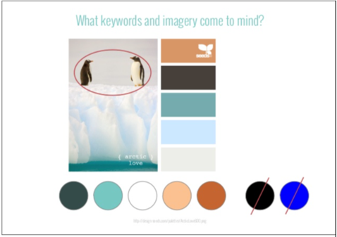
In the bit about color, Andy used the slide below to describe his process for choosing a palette for psychotherapy data at the University of Alaska. The client thought a lot of influence on the treatment score was caused by the arctic environment (light/dark) so he did some searching for inspirational color palettes around the 'arctic' theme.
To appropriately affect behavior, decision, and emotion: our choices around color must be tailored to content, context and audience of our data.
In other words: as authors, we must “author”.
We must .
Community Innovation
New features such as are frequently added into the product. And other tools exist, such as the , to enable quick and easy custom palette creation for Tableau.
Andy Cotgreave richly explored the topic of during Tableau design month. That was post 2 of 11 in a lengthy series on design, all of which is very nicely summarized in the grand finale:
Over the past month, I've deconstructed a dashboard I made for Tableau's internal VizWhiz competition. Below is an attempt to quantify the Impact and Difficulty of each of the design choices I made.
Zen Master Robert Rouse then very nicely describes the mechanics of customizing .
And it is this, ability to customize your own color palettes, where I will continue to dive more deeply from here. Because personal innovation with color is so easily accomplished using features and tools already available!
Custom Palettes
Taking Andy Cotgreave’s design month as inspiration, Kris Erickson has contributed several new palettes, each built on the principal of muting some values while emphasizing others.
Those new palettes from Kris are found in his . And while a with the .tps file appears to be momentarily broken, I happen to have a copy. So Kris, I hope you won’t mind that I’ve printed it here to .
If you haven't used them, James Davenport’s “Cubehelix” color palettes are most delightful. “Cubehelix” is a programmatically generated color scheme, one that always de-saturates down to black and white.
This makes it not only a great option for those who are color blind, but also an excellent choice for charts that may be printed without color.
Moreover, they are simply beautiful. A detailed description, and a link the .tps file are both found here:
Earlier this week, Ryan sleeper wrote a very informative post about improving the design of your data visualizations with your color choices. He touched on how straying from the built-in Tableau color palettes can give your dashboards a more custom feel, solidify the theme, and effect the appeal of the dashboard to your audience.
Personal Innovation
So, yes! Much has been written, much has been done!
Yet, a huge opportunity remains untapped. And this is especially true in the space of personal innovation, with our own use of color as individual Tableau authors.
Every single day. Your personal innovations can be simple, such as Ben Jones’ .
Or they can be more complex and “hackier”, like my curious discovery of a novel way to , or Jeffrey Shaffer & Russell Christopher's exploration of in the Preferences.tps file.
Regardless of the complexity, I hope this post will encourage you to make personal explorations and innovations with color, and to "author" away from the default palettes in Tableau.
Reference Guide
As we conclude, should one reference be the only link needed to get your creative juices flowing around color, then look no further than the color section of Jeffrey Shaffer’s . It is a wonderful resource.
Perfection is a Process
Remember that small decisions make a big difference. Far more than reaching perfection, the most important part of personal color innovation is to simply get started with exploring.
Please watch this space for my next installment, where I will share a few of my recent personal innovations with custom color palettes in Tableau, their uses, and how they came to be.
This is part of a series of posts about the 'little of visualisation design', respecting the small decisions that make a big difference towards the good and bad of this discipline. In each post I'm going to focus on just one small matter - a singular good or bad design choice - as demonstrated by a sample project.
Word Count: 939
References
- "The Importance of Emotions In Presentations", Leslie Belknap, Ethos 3, February 11, 2015
- "No More Red Yellow Green", Stephanie Evergreen, Evergreen Data, September 23, 2015
- "The Explosion of Crayon Colors Since 1903", Pamela Engel and Megan Willett, Slate.com, October 5 2014
- "Leveraging Color to Improve Your Data Visualization", Ryan Sleeper, Tableau Public, October 7, 2013
- "Talk Slides: Thinking About Data Visualisation Thinking", Andy Kirk, slide #42, Visualising Data, October 28, 2014
- "The Little of Visualisation Design: Part 6", Andy Kirk, Visualising Data, March 10, 2016
- "Feature Geek: Coloring Labels with Mark Colors in Tableau 9.2", Jonathan Drummey, Drawing With Numbers, November 30, 2015
- "Color Tool for Tableau: A Simpler Way to Create Custom Color Palettes", InterWorks, December, 15, 2014
- "Choosing the right colours for your visualizations", Andy Cotgreave, Gravy Anecdote, November 21, 2014
- "Tableau Design Month, post 12 of 12: the big recap", Andy Cotgreave, Gravy Anecdote, November 25, 2014
- "Understanding Sequential and Diverging Color Palettes in Tableau", Robert Rouse, InterWorks, December, 15, 2014
- "Cotgreave Palettes", Kris Erickson, Cotgreave Palettes, Tableau Public, October 23, 2015
- "More Tableau Color Palettes", Kris Erickson, Erickson Data, Tableau Public, 2015
- "More Tableau color palettes", Kris Erickson, Cotgreave Palettes, Tableau Public, October 23, 2015
- "More Tableau Color Palettes", Kris Erickson, PDF File, Dropbox, March 30, 2016
- "Choosing Colors for Accessibility (cube helix)", Tableau Public, October 11, 2013
- "Sunset Color Palettes", Ben Jones, Data Remixed, March 20, 2015
- "Color the Dupes", Keith Helfrich, Red Headed Step Data, January 8, 2015
- "Exploring the Tableau Preference File", Jeffrey Shaffer and Russell Christopher, Data + Science, October 26, 2014
- "Tableau Reference Guide", Jeffrey Shaffer, Data + Science, March 30, 2015
- "The Little of Visualisation Design: Part 11", Andy Kirk, Visualising Data, March 29, 2016
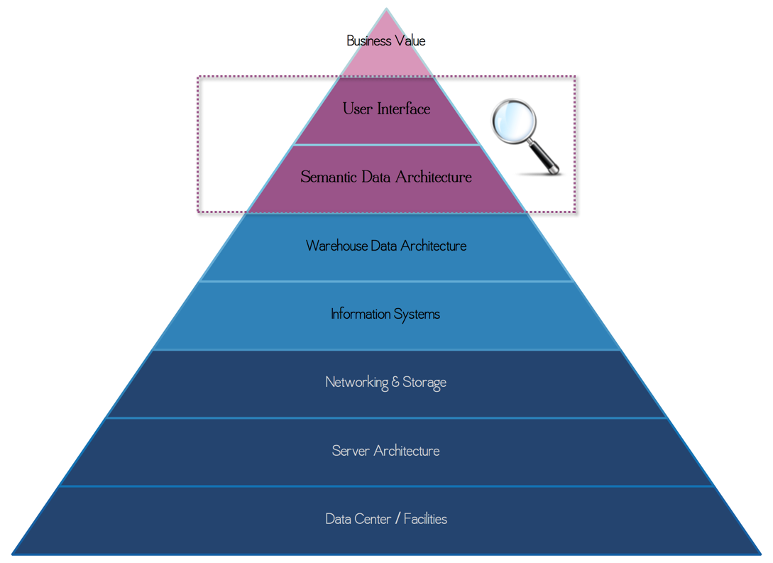
This post builds upon the theme of designing a performant data architecture for your high volume solutions in Tableau.
One core performance concept is that good design considers the entire solution stack. If you fail to design for performance at all vertical levels, then the worst performing layer will make the solution slow. A train is only as fast as the slowest car. And worse, if various layers have design problems, then your train likely isn’t moving at all.
We must consider the entire vertical solution, together as a holistic system, from the top to the bottom. And this design investment is best made at the outset. To focus performance efforts at only a single layer or to return to a poor performing system in hindsight in search of "one thing" to fix is insufficient.
Of the various layers in the typical solution stack, this post is focused on two: User Interface Design and Semantic Data Architecture.
Yes, as UI designer in Tableau you are also a Data Architect!
Guided Analysis
As with any “big problem", the solution to good performance on large data volumes is to break that big problem up into smaller pieces.
Sure, the entire thing may be too large to tackle all at once. But individually the smaller pieces are each manageable on their own. As with all big challenges in life, this is also true in data design!
My previous post introduced the concept of building a Guided Analysis along with an innovative solution to multi-select, cross-data source filtering in Tableau.
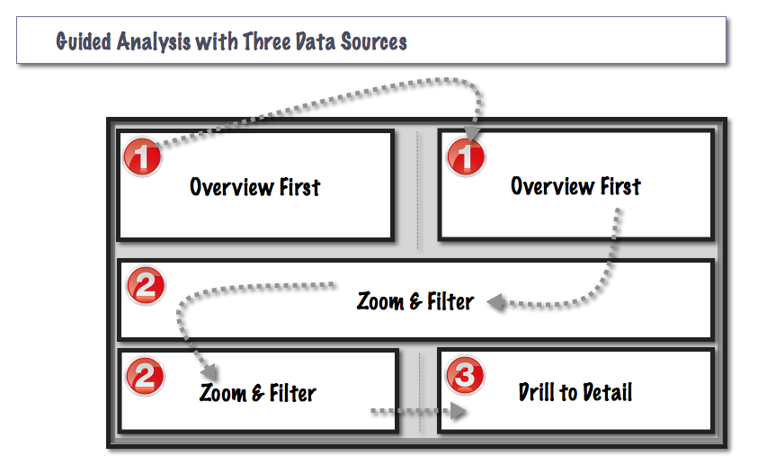
Here we begin with a high level overview of the Guided Analysis, exploring what it actually looks like in terms of performant design.
I suggested in the advanced menu post that a typical Tableau dashboard that is built on large data volumes will likely follow Schneiderman's mantra4:
"Overview first, zoom and filter, then details-on-demand."
In this way, the Guided Analysis becomes a Yellow Brick Road: one that your audience can follow along, to explore in search of the "Emerald City" within their data.
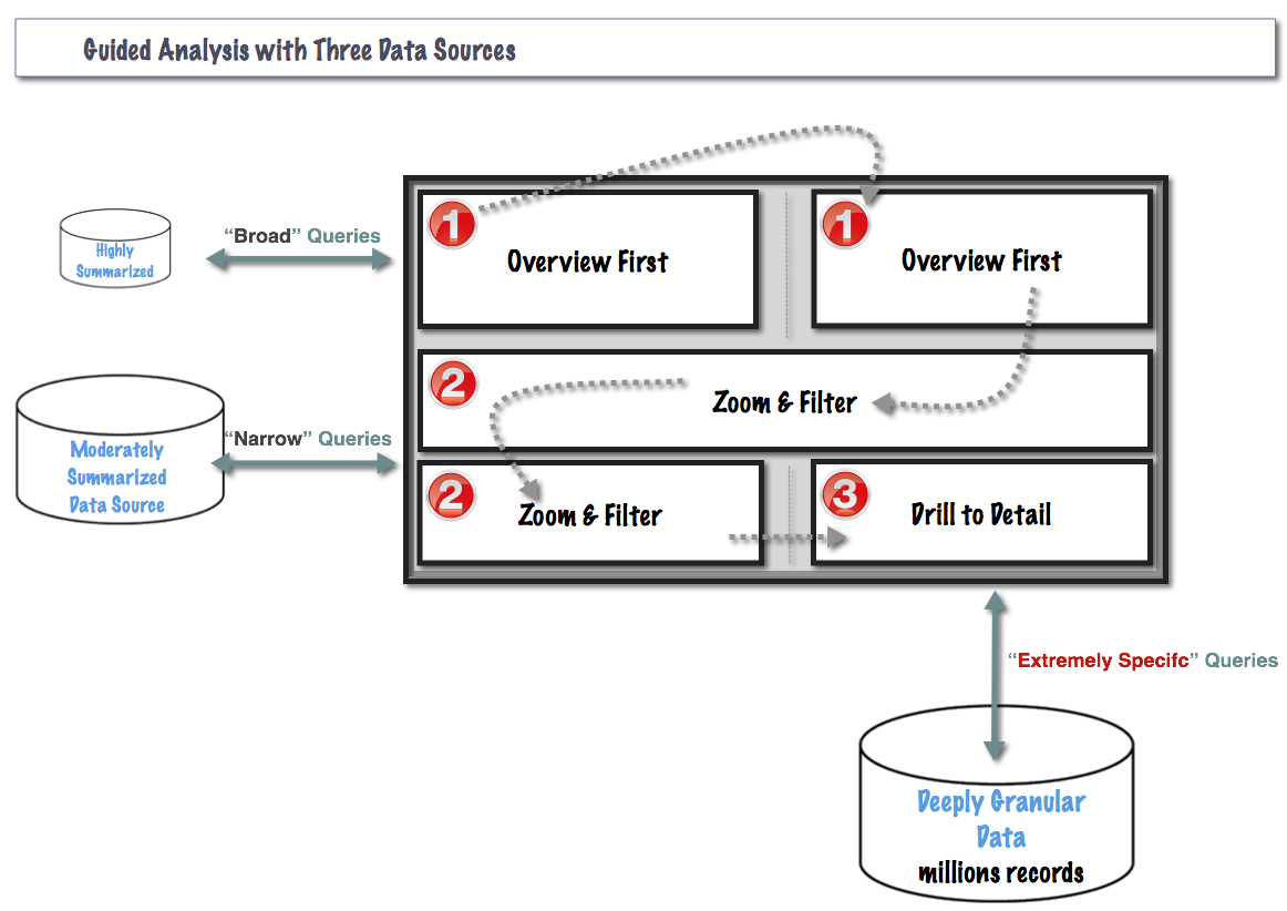
Especially on large data volumes, for good performance the overview and zoom & filter views should always select from a pre-aggregated data source. Summarization requires computation. And computation takes time.
The granularity of each data source is tailored to the views it will serve, to avoid summarization at runtime.
If a view renders four bars, there is no good reason to build it from a data source with 400 million records. Shown with red numbers, Kate Morris and Dan Cory have demonstrated a performant Tableau dashboard built on three separate data sources.
This Works Because
As each subsequent data source becomes deeper, the queries against it become more and more narrow. So, even on large data volumes, the dashboard performs because you’re always asking the broad and expansive questions of a shallow data source. And you’re asking only very narrow questions of the deeply granular data.
Combined with an optimized columnar database, these narrow questions of deep data can still perform very, very well! This is something we’ll expand upon in the future.
Cross Tabs
To weave in another recent suggestion, , it is usually only in the final "drill to detail” portion of Schniederman’s Dashboard that an Excel like cross-tab of rows and columns becomes appropriate. Not before.
In the earlier stages of the guided analysis ("Overview First" and "Zoom & Filter"), rendering summary comparisons visually leverages the pre-cognitive processing powers in the human brain. This allows your audience to "respond to what they see”, without having to think about it.
Then, towards the end, only after they have zoomed and filtered, only then is a cross-tab of hard facts perhaps appropriate. These are the emeralds they were searching for!
So now we understand why building a Guided Analysis is relevant to performant data design. Let’s move on to Logical Partitioning.
Logical Partitioning
Logical partitioning reduces search effort by grouping like items together, so the things we’re not searching for don’t get in the way.
We do this all the time, because it works. We logically partition our homes to keep the living room separate from the dining room. We logically partition our cities to keep the Industrial zones separate from Residential & Commercial areas. We logically partition files into folders, photos into albums. Even this blog post is logically partitioned!
Just as with the Guided Analysis, Logical Partitioning is another tactic for breaking that big problem up into smaller, more manageable pieces. And just as in other parts of our lives, logical partitioning also plays an important role in performant data design.
For Example
Let’s say our original data set has ~1 billion records. That’s a lot.
Depending on your infrastructure, even a million records could perform slow! Ten years ago, half a million records was huge. The point is: good design occurs at every layer of the solution stack and good data architecture is key to capturing the best performance from your hardware.
So, in this example, the number is a billion. And we will logically partition those billion records by Region.
We Do This Because
Search takes time. And on a big data set, even the best Guided Analysis with pre-aggregated data sources may not be sufficient.
Yet when the two techniques are combined together, now the bite-sized pieces are becoming much more responsive. Building a summary & detail data source for each of three distinct regions eliminates a huge amount of runtime search and runtime summarization.
Query times are faster because the data sets are smaller. Rendering is faster because we've saved cross-tabs until the end. Now the extracts are smaller. And not only do they finish faster, but the extracts can also run in parallel.
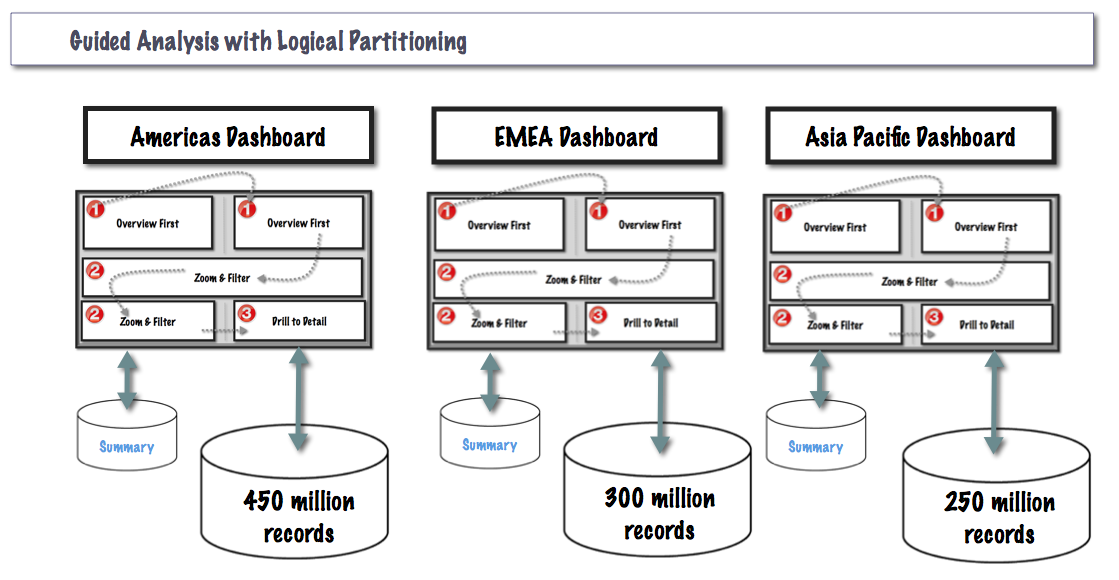
We've gone from a single solution on a billion records for everything, to three solutions each approximately one-third the size. And each with a summary data source for the summary views. Each rendering only the data required, one step at a time.
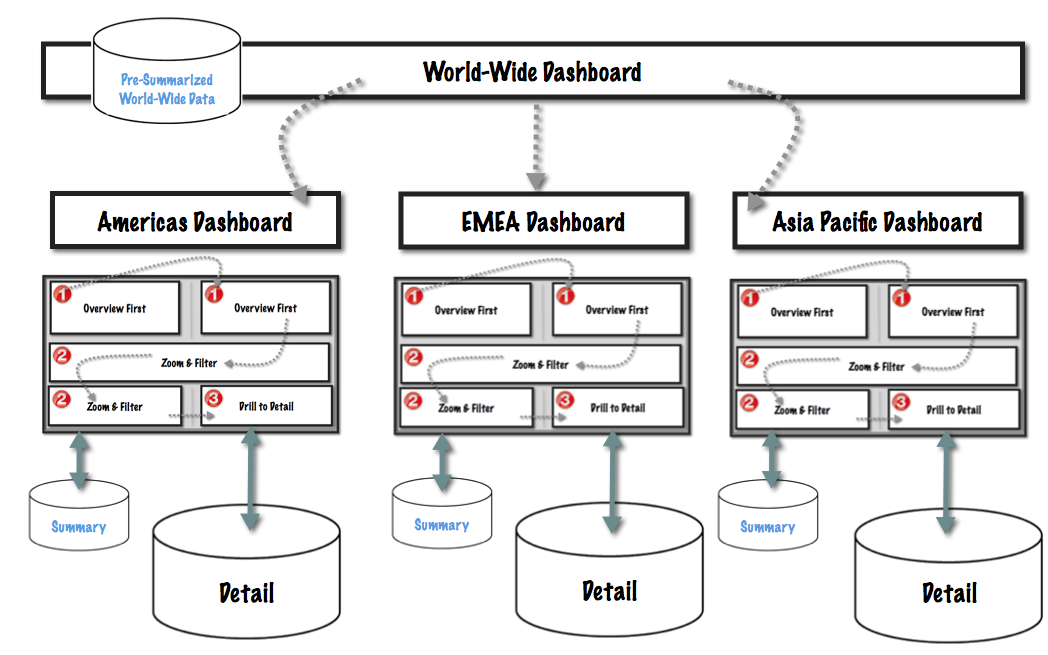
World-Wide
Enter the world-wide executives. These are high-level folks, whose decisions span across all regions. Their decisions span across all product categories, across all lines of business.
Now that each region is physically separated, have we lost the ability for these high-level individuals to compare across the logically partitioned data? Of course not!
These high-level decision makers don’t ever compare transaction level detail between regions. Rather, they only need a path to get to those transaction records when there is an exception.
The world-wide dashboard is therefore built on a pre-summarized data source at the world-wide level. Dashboard actions guide those consumers along their own Yellow Brick Road, tailored for them, down into the regional views, and eventually down to the record level detail.
World-wide executives are busy people. In reality, they likely won't drill down to the gory transaction-level details very often. But we certainly can, and should, build this for them! Imagine how happy that executive will be, late at night with a problem to solve, when they are able to find the detailed answer they're looking for:
- in a visually intuitive way
- with fast response time
- from the highest level summary down to the most granular line-item detail
This is good data design. And it is your job to build it for them.
Good performance is always the culmination of many, many design decisions. Good design must occur at every level of the vertical solution stack.
This post highlights two data design techniques for performance:
- Guided Analysis, at the User Interface Design layer
- Logical Partitioning, at the Semantic Data Architecture layer
Both techniques significantly improve performance by breaking up a large problem into smaller pieces. Combined together with the , it is possible to achieve both good performance and multi-select, cross data source filtering in Tableau.
Bad data design on expensive infrastructure is no solution at all. So, as the volume of data in our lives continues to grow, good data design techniques like these are imperative for maximizing hardware dollars.
Word Count: 1,379
References
- "Vertical Technology Stack”, Pyramid image built in Tableau by Noah Salvaterra, DataBlick, February 26, 2016
- "Advanced Menu as Dynamic Parameter", Keith Helfrich, Red Headed Step Data, January 13, 2016
- "Guided Analysis", Joshua N. Milligan, Learning Tableau, O'Reilly Media, April 27, 2015, p. 192
- "The Eyes Have It: A Task by Data Type Taxonomy for Information Visualizations", Ben Schneiderman, Department of Computer Science, Human-Computer Interaction Laboratory, and Institute for Systems Research, University of Maryland, September, 1996
- "TURBO CHARGING YOUR DASHBOARDS FOR PERFORMANCE", Kate Morris + Dan Cory, Tableau Conference 2014, Recorded Session, September, 2014
- "Open Letter to the Wall of Data", Keith Helfrich, Red Headed Step Data, October 7, 2015
This post describes how an "advanced menu" can be used to work around the need for dynamic parameters when filtering across multiple data sources in Tableau.
Concept
In his post "Creating a Collapsing Menu Container in Tableau", Robert Rouse does a great job of walking through the mechanics of how to build a "dynamic and collapsable menu" in Tableau.
Some of my favorite mobile apps like Slack, Feedly and Google Maps have a slide-out menu that appears when I tap a small icon. That common design element makes plenty of room for user inputs and gets them out of the way when you're done - perfect for small screens.
To elaborate further on that concept, in this note today I explain how we can leverage the idea of a "dynamic and collapsable menu” to tackle some additional, rather complex data design challenges.
Why Multiple Data Sources?
First off, why would we deliberately use multiple data sources in a single dashboard?
Well, on large data volumes, for performance! In fact as your data volume grows large, Data Architecture decisions like this one quickly become imperative.
For two years running at the annual Tableau Conference, the performance program manager for version 9.0, Kate Morris, and her peers have discussed the design for performance technique of using multiple data sources each at differing levels of detail.
This means, for a typical Tableau dashboard which follows Schneiderman's mantra2, "Overview first, zoom and filter, then details-on-demand”, the overview visualizations should be built upon an overview (pre-aggregated) data source.
Thus, the details-on-demand views are the only ones that query the deeply granular data. And, they do so with very specific and narrow queries, the result of having "zoomed and filtered" before drilling-down.
In other words, for optimal performance on large data: we want to avoid runtime summarization. Summarization requires computation. And computation takes time. For the best user experience, we definitely want to perform that summarization in advance instead of making our consumers wait for it in real time.
The and Tableau Conference sessions by Kate Morris and her colleagues are both titled "Turbo-Charging Your Dashboards for Performance".
Jonathan Drummey also speaks to this multi-source concept in his very thorough and recent treatise on when to extracts vs. a live connection.
I recently answered a question for a new Tableau user on when to use a Tableau Data Extract (TDE) vs. a live connection, here's a cleaned-up version of my notes: My preference is to first consider using a live connection because extracting data adds another step to the data delivery chain.
This brief note of mine is the first of various instructional posts I will write on the subject of Data Architecture for Tableau.
But, The Challenge
The difficulty arises however, when our multi-data-source dashboard must also employ headline filters. When filters need to work across all of the data sources, things begin to get complicated. And, as usual, options are available if you're willing to explore them.
Dynamic Parameter Work Arounds
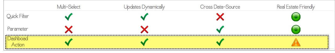
As of today’s writing, in Tableau version 9.2, various alternatives exist for emulating a "dynamic parameter like”, cross data source filter in Tableau:
- SQL:
- Alteryx:
- Javascript API:
- Blending:
The contra these approaches share, in my opinion, is that they force you to extend your work outside of the standard, friendly, Tableau canvas. So the genesis for this innovation was derived simply from the need to satisfy some very basic requirements while still continuing to work only within the standard, friendly, dragy-droppy canvas environment of Tableau.
The filter must:
- update dynamically
- be multi-select
- apply across data sources
How To Get There ?
Dashboard Actions! Up thru at least version 9.2, a dashboard action is the only mechanism for filtering that is both multi-select and works across multiple data sources in Tableau.
The only problem with them is, each new worksheet consumes a huge amount of real estate.
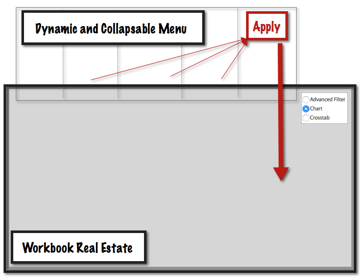
The Advanced Menu
By building an "advanced menu" (which is nothing more than a with basic worksheets inside), we can use those worksheets to drive action filters into all of the other data sources of the dashboard.
These simple worksheets in the "advanced menu" layout container needn’t be more than a dimension pill on the rows. This is more than enough to update dynamically when your underlying data changes. Depending on your needs, perhaps you’ll want to mimic the "Only Relevant Values” by applying one dimension to the other. And, by holding down the ⌘ key, the advanced filter sheets allow for multi-select.
The problem of too many sheets, occupying too much real estate?
That is solved by dynamically hiding the advanced menu out of sight when it isn’t being used: in negative space on the dashboard.

The Apply Button
Again for optimal performance: there is never a single, magic solution. Rather, good performance is the culmination of many many design decisions.
One problem you might encounter with your advanced menu is that, when holding the ⌘ key for multi-select, each click applies to every data source as you interact. And that can take time, especially if you want to multi-select various filters. Why watch the hourglass as you apply each filter incrementally?
We may prefer to instead select all of the filter values first, and then “APPLY” them at once to the dashboard.
This is easy to do with an APPLY button. The dashboard actions on the “advanced filter” sheets each have the APPLY button as their only target. And from there, the APPLY button has the worksheets in your dashboard as the targets.
Faster Still ?
For the fastest "popping" action, try to build your advanced menu sheets from the smallest data source possible.
Clicking Thru The Layers
One challenge you may have faced, when building sheet popping into your own solutions, is that the layout container that you use for the “popping” action blocks your mouse from clicking into an underlying layer that is “behind” the container.
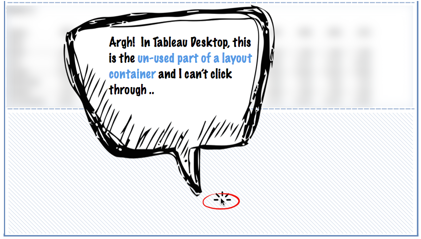
Fear not, however. Because in Tableau Server, majestically: that empty space of the layout container can be clicked through. And in Tableau Server, it is possible to interact with the worksheets that lie behind that empty space of the layout container.
This means that once you publish to Server, then in the web browser you can completely interact with the dashboard; even if that layout container driving the “advanced menu pop” occupies the entire dashboard real estate (which, in Desktop, renders things rather un-useful).
This apparent disconnect between the behavior of Desktop and Server is one that we’ve observed for more than a year now. I called it out in the Tableau Community forums . And, .
While there’s no definitive promise from Tableau that they will keep the server behavior the same, because I’ve been using this to my benefit for more than a year now, intuition tells me that this is a fairly safe piece of functionality to take advantage of!
In Summary
In his excellent post, Zen Master Robert Rouse illustrates the mechanics of how to build for Quick Filters.
The very same approach can also be used to build a dynamic collapsing menu made of worksheets. And those “advanced menu” worksheets can be used to effectively achieve a multi-select, dynamic, cross data source filter mechanism via Dashboard Actions.
In addition, for optimal performance on large volumes of data: there is no substitute for a well-thought Data Architecture.
To avoid runtime summarization, it is advisable to customize your data sources down to only the minimum level of detail required by the sheets which make use of them. This approach often necessitates cross data-source filtering. And, the advanced menu is a great way to move forward in these situations.
Of course, coming in version 10, Tableau has announced plans for native cross-data source functionality from quick filters. Never-the-less, even then, you can be certain that future problems will require future creative solutions.
Thanks!
Word Count: 1,252
References
- "Creating a Collapsing Menu Container in Tableau", Robert Rouse, InterWorks, January 04, 2016
- "The Eyes Have It: A Task by Data Type Taxonomy for Information Visualizations", Ben Schneiderman, Department of Computer Science, Human-Computer Interaction Laboratory, and Institute for Systems Research, University of Maryland, September, 1996
- "TURBO CHARGING YOUR DASHBOARDS FOR PERFORMANCE", Kate Morris + Dan Cory, Tableau Conference 2014, Recorded Session, September, 2014
- "TURBO CHARGING YOUR DASHBOARDS FOR PERFORMANCE", Kate Morris + Rapinder Jawanda, Tableau Conference 2015, Recorded Session, October, 2015
- "TDE or Live? When to Use Tableau Data Extracts (or not)", Jonathan Drummey, Drawing With Numbers, January 05, 2016
- "Dynamic Parameters - a sorta hack", Nelson Davis, The Vizioneer, June 18, 2014
- "Crosspost from DataBlick – Tableau Dynamic Parameters Using Alteryx", Jonathan Drummey, Drawing With Numbers, August 30, 2015
- "Dynamic Parameters in Tableau", Derrick Austin, InterWorks, December 17, 2015
- "Creating a Dynamic 'Parameter' with a Tableau Data Blend", Jonathan Drummey, Drawing With Numbers, August 02, 2013
- "Sheet Swapping and Popping with Joe Oppelt (and a Tip on Searching the Tableau Forums)", Matthew Lutton, MLutton BI, October 04, 2014
- "We made a video of Sheet Swapping and Legend/Filter Popping on a dashboard.", Comment by Keith Helfrich, December 07, 2014
- "We made a video of Sheet Swapping and Legend/Filter Popping on a dashboard.", Comment by Keith Helfrich, September 11, 2015
- "Creating a Collapsing Menu Container in Tableau", Robert Rouse, InterWorks, January 04, 2016
Here you'll find an example to build upon when writing to those who insist on using Tableau to build "giant walls of tabular data".
...
Dear person who insists on giant cross-tabs of data in Tableau:
It was a pleasure to speak this morning! As we’ve discussed last week, the difficulties you face stem from the fact that you are attempting to do with Tableau what is specifically not recommended.
Tableau is a data visualization tool. It is not a spreadsheet, not a “tabular report builder”.
After looking at your challenges in more detail, it would seem that you must speak with your stakeholders and soon decide between one of two broad categories of alternatives:
Choice #1: continue to use spreadsheets and "giant walls of raw numbers with conditional formatting" to make business decisions
- Here, your best decision may likely be to avoid Tableau
Choice #2: leverage the visual display of quantitative information to enhance cognition and reach better business conclusions faster!
- Here, continue with Tableau and render your data visually
In support of the above conclusion, please find below a collection of reading materials.
What is Tableau not really good for?
"We suggest you consider revisiting your requirements or consider another approach if: …
.. You need highly complex, crosstab-style documents that perhaps mirror existing spreadsheet reports with complex sub-totalling, cross-referencing, etc."
“1. To Replicate a report or chart designed in another tool"
"Tableau is a data viz tool, thats all it is. It's not an ETL tool. It's not a spread sheet. It's not a project planning tool. Sure you can do some of that stuff in it, with a lot of work. But really is that the best use of your time?"
Moreover, here in the center of excellence, we strongly espouse the notion that "There is no such thing as a Tableau Developer.”
Development
"Development is the technical implementation of someone else’s ideas.”
..
"The idea that satisfying business information needs is an activity that ends up with someone developing something, that someone else thought up, in response to someone else's concept of what yet another person needs, in the traditional SDLC paradigm, is just flat wrong."
Authorship
"Tableau provides the opportunity for one to work at the creative intersection of cognitive, intellectual, and experiential factors that, when working in harmony, can synthesize the information needs of the person seeking to understand the data and the immediacy of direct data analysis. This mode of Tableau use can eliminate the lags and friction involved when there are multiple people between the person who needs to understand the data and the person who creates the vehicle for delivering the information from which insights are gleaned."
In this way, by playing to the strengths of the tool, we find the ideal approach is for the business analyst to use Tableau directly.
When building production scale data solutions, such as the one you are building, then the ideal approach is for the technical specialists to embed directly into the same room, together with the business users, working iteratively to marry together the business needs with the technical solution, visually.
As an example of how this approach has already produced huge success within our organization, here attached is the case study from the most recent win that we discussed last week and again this morning.
And to this end, a proven methodology exists, that we can follow, to scale self-service visual analytics.
Finally, as reference material, to convince your stakeholders:
- Visuals are processed faster by the brain
- Visuals are committed to long-term memory easier than text
- Visuals can tell stories
- Visuals can reveal patterns, trends, changes, and correlations
- Visuals can help simplify complex information
- Visuals can often be more effective than words at changing people’s minds
Thank you!
Word Count: 660
References
- "Best Practices for Designing Efficient Tableau Workbooks", Third Edition, Alan Eldridge, Tableau Software, July 12, 2015
- "How NOT to use Tableau", Robin Kennedy, The Information Lab, August 27, 2013
- "An inconvenient truth : Tableau is not a swiss army knife", Matt Francis, Wannabe Data Rockstar, November, 2014
- "Tableau Wasted?", Chris Gerrard, Tableau Friction, May, 2015
- "Dear Mr. or Ms. Recruiter", Chris Gerrard, Tableau Friction, April, 2015
- "Tableau Wasted?", Chris Gerrard, Tableau Friction, May, 2015
- "The Tableau Drive Manual", A practical roadmap for scaling
your analytic culture, Tableau Software, September, 2014
- "6 Powerful Reasons Why Your Business Should Visualize Data", Maptive, October 6, 2015
Bolstered by the brain trust at , this post considers various uses for in Tableau, and argues for more formal data preparation as the best alternative when blending breaks down.
For Starters
If you're just getting started, first some useful resources:
- &
All of the 2014 conference materials are an excellent resource. There are ten different talks with the keyword “blending", and my makes it easy to find what you’re looking for.
So now, on with the show!
Slide Projector
As an analogy, think of Tableau as a slide projector for your data where each Tableau Data Source is a slide.
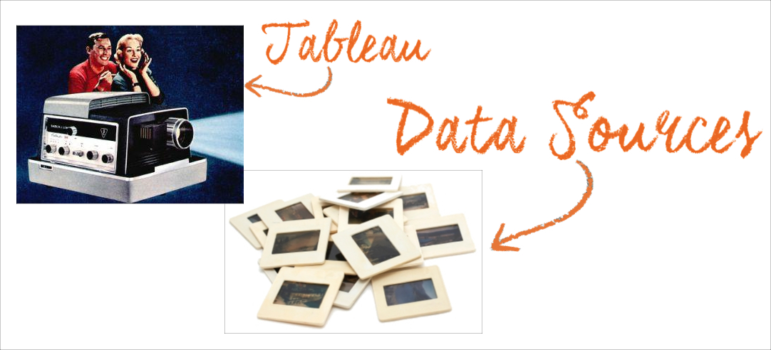
Born from a hackathon among Tableau’s engineers, Data Blending is indeed a clever hack! It allows us to place more than one slide into the projector at once :)
Starting in version 8, "Data Blending 2” also allows us to manually turn off & on the linking fields, regardless of whether those fields are utilized in the view. The difference between DB1 & DB2 is one of the . Cool stuff! And worthwhile to understand.
Yet, robust as it is, there is a time & place for blending in Tableau. Much of the time, my "in the flow” preference will be to use the projector with a single tidy data source.
The more complicated the requirements become, the more frustrating my across-the-blend experiences tend to be. And there are also occasions when data blending is perfect.
So, let's sift through some scenarios to separate wheat from chaff.
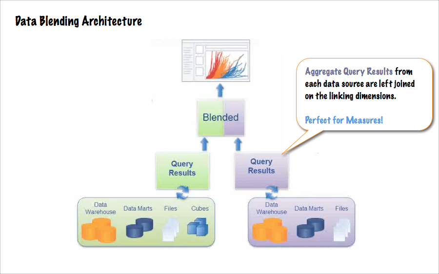
Great for Measures
One great use for Data Blending is to summarize measures from your secondary data source. This is where blending is at its best & you can play to its strengths.
As an example scenario: sales data originates from your Data Warehouse, upon which you've built a single tidy data source. Your regional sales manager has revised her quarterly plan, which she sends you by e-mail in a spreadsheet to compare with the actuals.
This is the perfect use for data blending in Tableau.
The revised plan numbers are hot off the press. They aren't available in your primary data source, and the task at hand is to compare aggregate measures (actuals vs. plan), by linking on one or more common dimensions (like region, salesperson, or category).
Exploratory Prototyping
If the general preference is to use the slide projector with a single tidy data source, then frequently a data discovery phase must also exist (during which we will research & design that data source).
Or, perhaps data discovery is the only goal. We only want answers, and we want them quickly!
In these exploratory prototyping modes, some sacrifices to performance, "flow" and the end-user experience are happily made in exchange for rapid data discovery.
Contributing ideas for the post, said:
Data Blending is great for one-off analyses or proofs of concept where the speed of using a blend is the advantage.
Then when it comes time to have something for production (where there's more complexity to the data structure, a need for something more maintainable, higher volumes, etc.) I'll do the necessary data prep.
Scaffolding
Using a scaffold data source to build up a temporary structure for the purpose of painting data onto it, "scaffolding" is another .
And scaffolding is also a great example of how data blending can, at times, make the impossible possible inside of Tableau.
A great example of a scaffold would be if you want to build a calendar view: something similar to what Interworks & Andy Kriebel have described and .
If instead of the Gregorian calendar you need to display the transactions inside of your company's fiscal calendar, then you can use the fiscal calendar as a scaffold data source and blend your transactions by linking on, for example:
[order date] == [fiscal date].
This is a quick win, and easy to do with data blending.
Problem Context
Yet, data blending is not a panacea.
While transaction data does frequently originate from one source, today's reality is that additional measures & attributes external to this primary data must often be analyzed together with the primary data.
And often the requirements are more complex than the relatively simple scenarios above. We frequently need to slice, dice, filter, and perform calculations upon those secondary attributes and measures.
Tableau’s strength as a visualization engine is in rendering views of your primary data, and in building interactive dashboards on that primary data.
So while blending can be extremely helpful, the “blend" in Tableau also comes with a fair number of limitations, especially when attempting to build a production polished, highly interactive dashboard.
For examples of these limitations:
- explains why column totals break down across the data blend
- Blending often builds a temp table in the data source. And from a performance perspective:
- explains that when the linking dimension is not in the view, non-additive aggregates from the secondary source, like COUNTD(), MEDIAN(), and the RAWSQLAGG_xxx functions are not supported
- And provides a good long list of other limitations
The Problem Definition
Because disparate data often arrives at differing levels of detail, and the requirements are often interwoven & complex, building a highly interactive dashboard with multiple facets that each cross the blend can easily degenerate into a Rubix Cube of frustrations.
Just when you’ve worked around one limitation to get the to greens line up.. you encounter another one that breaks the reds. And fixing the reds can break the whites, etc.

As a result in my own recent experience, with data coming from three distinct sources: the only option with blending was to always bring all the detail into the view. And then from there, to use table calcs to summarize back up again to the desired level of detail.
Computing across multiple dimensions, including time, those table calcs quickly became complex. And because of the granular data volume, the table calcs also performed poorly.
So it just wasn’t practical to achieve the desired results in a production quality dashboard via blending, across multiple data sources at differing granularities; and with each data source providing dimensions to filter by.
The good news ? Just as soon as those disparate data sets are joined together into a single, tidy data source then building is a breeze again!
Think Data Preparation
When you find yourself facing a Rubix Cube of frustration, working around one limitation only to encounter another, this is the signal that you're trying to jam too many slides into the projector all at the same time.
Regardless of which approach you choose, the goal of your data prep is to unify those disparate sources into a single, tidy data set.. at a single, common granularity.
In other words: you want one slide for your Tableau projector.
Some Alternatives
1. Alteryx
A flexible & multi-faceted swiss army knife, Alteryx enables the point & click construction of customized, maintainable, repeatable, and self-documenting data manipulation pipelines.
It’s no wonder why so many data workers today are using Alteryx as their tool of choice for data prep, prior to visual analysis in Tableau.
2. SQL & Scripting Languages
What Alteryx can do quickly via point & click, the talented analyst can also accomplish for FREE with a little bit of time, SQL, Python, R, or similar data transformation languages.
3. Case Statements
Like many of the tricks up my sleeve, this creative solution comes from .
If your secondary dimension values are really just labels for your primary dimensions, and/or they are used to apply higher-level (coarser) groupings, then you can easily bring those secondary dimensions into your primary data source with a calculated field.
CASE [primary dimension]
WHEN “dimension value A” then “secondary dimension value 1"
WHEN “dimension value B” then “secondary dimension value 2"
WHEN “dimension value C” then “secondary dimension value 3"
WHEN “dimension value D” then “secondary dimension value 4"
END
This trick will work even if your dimensions are of a high cardinality, with hundreds of entity values. To build the large case statement, just follow these instructions from Alexander Mou.
In Summary
Keep calm and use the flow. As a rule of thumb, Tableau works best when all of the dimensions are in a single data source, at a common level of detail.
Data Blending is often great, but not always. And when you find you have too many slides for the projector: get prepared.
A few initial data preparation steps to unify & tidy, prior to visualization with Tableau, will keep your visual analysis work in the happy zone.
Now you’re playing to Tableau’s strengths again!
Word Count: 1,529
References
- "DataBlick", Home, September 12, 2015
- "Understanding Data Blending", Tableau Online Help, September 12, 2015
- "Data Blending - On Demand Training Video", Tableau, On Demand Training, September 12, 2015
- "Additional Data Blending Topics - On Demand Training Video", Tableau, On Demand Training, September 12, 2015
- "Two Use Cases Where Blending Beats Joining in Tableau 8.3", Tom McCullough, InterWorks, March 24, 2015
- "9 Data Blending Tips from #data14de", Bethany Lyons, Tableau, May 27, 2014
- "Data Blending - How it is like and not like a Left Join", Jonathan Drummey, YouTube, July 1, 2015
- "Extreme Data Blending", Jonathan Drummey, TC14 Video Replay, September 10, 2015
- "Tableau Conference Television", Keith Helfrich, Tableau Public, November 17, 2014
- "Master Tableau Concepts", Keith Helfrich, Red Headed Step Data, June 22, 2014
- "About Us", DataBlick, September 12, 2015
- "Master Tableau Concepts", Keith Helfrich, Red Headed Step Data, June 22, 2014
- "Creating Calendar Views In Tableau", Dustin Wyers, InterWorks, May 22, 2012
- "Creating an interactive monthly calendar in Tableau is easier than you might think", Andy Kriebel, Data Viz Done Right, May, 2012
- "Blended Boolean Column Totals are Not What They Seem", Keith Helfrich, Red Headed Step Data, January 24, 2015
- "Temp Tables Take Time", Keith Helfrich, Red Headed Step Data, January 18, 2015
- "Data blending: Support non-additive aggregates (COUNTD, MEDIAN, RAWSQLAGG_xxx) when linking dimensions are not in the view", Idea 2250, Jonathan Drummey, Tableau Community Forum, June 7, 2013
- "Enable missing functionality for secondary datasets: Sets, Rank, Sort, Polygon/Line maps, Lat/Long (generated), and relationships between multiple secondary data connections", Idea 2273, Amy Stoub, November 6, 2013
- "About Us", DataBlick, September 12, 2015
- "Coding Case Statement Made Easy", Alexander Mou, Vizible Difference, July 15, 2015
This post helps you to understand how the granularity & the shape of your underlying data will affect the visualization work you do in Tableau.
I was recently stumped by a common problem, one for which Jonathan Drummey back in 2012 has started a page to document the many scenarios in which this type of complication can occur.
My particular scenario was . And Jonathan's collection of similar scenarios is
The most interesting thing about each of the scenarios in Jonathan's collection is not their individual solution in isolation. But rather, the underlying pattern behind those solutions: the what they share in common.
And when Joe Mako helps me get through something on a Sunday afternoon, you know the answer is worth sharing!
The number one, most important facet of learning Tableau, and learning from Joe, is to recognize the patterns that recur. By recognizing common patterns when working with data, and by learning the behaviors of Tableau, one learns to reach a flow state with similar encounters in the future, even while the details may vary.
So let’s look at the patterns.
The Scenarios
- shift starts & shift ends for employees
- utilization rates with start time & end time
- work orders that arrive, take different amounts of time to process, and are then are completed
- patient records with admit date & discharge date
- etc.
The Pattern
What each scenario has in common is the shape of the data
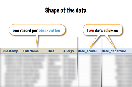
One row per incident, with two date columns per row. One date for the beginning & another date for the end
And the type of question being asked is always something like:
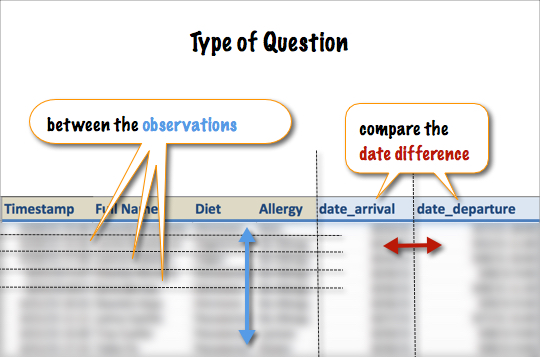
Among these observations, compare the difference between the two date values
Tableau Prefers Tidy
In his paper on the subject of tidy data in the Journal of Statistical Software³, Hadley Wickham draws this definition:
- Each variable forms a column
- Each observation forms a row
- Each type of observational unit forms a table
To which, I would add:
4. Related tables share a common column that allows them to be linked
Tableau Prefers Tidy Data. And rightly as an analyst, you also prefer tidy data!
A Discussion of Shape
But wait there. My data is tidy.
For all of these scenarios, every data set has a single column per variable. Each collection of observations is comprised in a single table. And each observation is in a new row.
- The survey data has one new row for every survey response
- The work order data has one new row per work order
- The patient records have one new row per patient
- etc.
So here we make the distinction..
Lookup vs. Transactional
The data structure, or shape, for each of these scenarios is indeed perfectly tidy: as a lookup table. And the tidy lookup shape of these data sets can easily answer lookup questions, like:
- Does Garrett arrive before Cecilia ?
- Who is allergic to Nuts ?
- How many Gluten Free will arrive on Wednesday ?
- etc.
When comparing the open & close dates, this lookup shape very easily allows Tableau to calculate the number of open work orders for one specific date. On April 26th, for example.
But the lookup shape does not easily answer these transactional questions across multiple dates:
- On each day, across all dates, how many Gluten Free are coming for dinner ?
- On each day, during the entire month of March, what was the count of open work orders ?
- etc.
Because the observations begin & end at a varying pace, the lookup data shape doesn't allow for Tableau to easily perform these calculations.
In fact, asking transactional questions of a lookup data shape is nerve wracking!
The Solution
So the common pattern to each solution in Jonathan's collection of scenarios is to reshape the data to make it transactional.
Some scenarios have solved their problem by reshaping with SQL, some may prefer to choose Alteryx. I've reshaped my headcount data using R.
But it doesn’t matter how. The point is, transactional questions call for tidy transactional data.
One record for each transaction
What’s Interesting
What’s interesting here is that, by the time Joe could set me straight, I had found a way to answer my question without reshaping the data. That approach required a scaffold & complex table calculations.
So while it may be true, that if you torture yourself for long enough then you can get the lookup data to talk; and while it may be fun to explore what's possible with scaffolding & table calculations, those complex solutions are difficult to maintain. And they aren't very flexible.
Reshaping is Easy
Moreover, if you're working in a spreadsheet, then reshaping your lookup data to be transactional for these scenarios needn't require SQL, or Alteryx, or R.
In this case, making your lookup data transactional is literally as easy as duplicating the data set & inserting a new column.
Half of the duplicated records should now have the date_type = “begin date”, and half the duplicated records should now have the date_type = “end date”.
In the work orders example:
transaction_type = "open"andtransaction_type = "close"
It’s that easy.
Granularity
Important to note! Now you’ve now doubled the number of records in your data set. So, for these lookup questions:
- How many total patients have we treated ever
- How many Gluten Free exist in the data set
You must be absolutely careful to avoid duplicating the value of your aggregate measures.
Each of those old-fashioned lookup questions should still be answered from the original lookup table. Or, perhaps, from your new transactional data, but with a filter to consider only half of the duplicated records.
In Summary
The great Noah Salvaterra once said,
"The granularity is always in your face."
And the great Joshua Milligan writes,
In the end, this post is all about granularity.
Word Count: 989
References
- "Headcount, when given the Arrival & Departure Dates", Tableau Community Forum, Jul 19, 2015
- "Utilization, Queues, Census, Throughput for Blocks, Floors, Units, Rooms, Offices, etc. - What do you do?", Tableau Community Forum, Nov 21, 2012
- “Tidy Data”, Hadley Wickham, Journal of Statistical Software, MMMMMM YYYY
- "THE FIRST QUESTION TO ASK”, Joshua Milligan, VizPainter, Jan 13, 2015
In this post I make the logical argument for to evolve their pricing model towards freemium.
Two years ago when I first came across Alteryx at a meet-up in their San Francisco office space, the product wasn’t as mature as I find it today. And returning just now from the conference in Boston, I'm quite pleased by both the scope & pace of recent developments, as well as the future product roadmap.
During these past two years, my Twittersphere has also been increasingly abuzz about Alteryx. In fact, given the strong endorsement it receives from people who’s technical opinion I rely upon, Alteryx is a tool that I would have tried again by now, if not for the entry price.
Below I will argue that tens of thousands of data workers exist in the world, just like myself, who are each potential Alteryx customers, but who will never try the tool in earnest until they have access to a more gradual on-ramp in terms of free & low cost pricing for simplified versions of the tool.
Back of the Napkin
To examine today’s pricing model with some napkin calcs, if we assume that a line of business data worker today earns roughly ~$100,000 per year with a 25% overhead, then Alteryx need only to save 75 minutes of that person's time per week to justify a designer license for them.
Given the higher salaries the Bay Area, we can adjust that number down to only 30 - 60 minutes of time savings per week as a break even point. Or in other parts of the world, the break even may land between two or two and a half hours per week.
Given the complex nature of today's data environments, and the challenges data workers face, this math is already powerfully persuasive.
Today’s Realities
Yet a data worker today, even one who wants to use a tool like Alteryx, must first convince their management to make a $4,000 annual investment. And to be convincing, they need to demonstrate that Alteryx will irrefutably bring about efficiency gains. They must use the software to solve a real-world problem. And to do that, they need to invest their time.
They need to try before they buy.
So at the outset of a 30-day trial period, said knowledge worker with the sincerest of interest takes two looks at the following to-do list:
- make the time
- learn the tool
- solve the problem
- package the results
- convince the decision makers
- circle back to persuade the skeptics
All in 30 days, and with the fair risk that some decision maker will still, for some reason, say "no".
For many, it’s a non-starter. This is a potential customer, who truly hopes that a tool like Alteryx can enable them to solve bigger problems faster. And yet, it’s not worth their time to investigate further because the on-ramp is too steep. The cost of their potential disappointment is too high.
Hence the demonstration of business value never occurs.
Role Models
Alteryx in my opinion has two strong role models to follow as they mature as a company & product: and . Tableau has proven that the "empowered business user" has traction in analytics & BI. And Salesforce has proven both subscription based pricing & the pivot of their product into a platform.
Thanks to their clever understanding of the principals at the heart algorithm, those tens of millions of hits driven daily by , a free public offering from Tableau, allow for Tableau to effectively own important organic search keywords of their choosing, like “business intelligence software”.
Tableau Public also provides an invaluable testing ground for new product features, a proving ground for scaling their server software, and intrinsic value to society by helping journalists & educators. Most importantly: Tableau Public generates brand recognition & good will.
Tableau also offers free desktop licenses to University students, another important freemium on-ramp to help newcomers in the front door.
Thus, I will argue: having embraced Tableau as a role model by placing the empowered business user at the heart of their identity, Alteryx would do well to further follow with an easy-entry freemium pricing model.
Salesforce has championed recurring revenue by pioneering subscription based licensing for software. And Salesforce have also very cleverly transformed their product into a platform, now at the center of a vibrant ecosystem.
And yet, Salesforce also strike an exceptionally low cost to get started. Among the many SFDC customers who spend six digits annually on their software, a great many started their journey spending only hundreds of dollars per year.
How did these customers get to where they are now, spending six digits annually? Gradually, one step at a time.
Salesforce makes it easy for new customers to get started because they know that once they’re positioned at the center of a key business processes within a growing company, then the recurring revenues will increase over time.
Having already embraced Salesforce as a role model by implementing a subscription based licensing model, I will argue: Alteryx would do well to further follow by implementing an easy entry on-ramp for potential new customers to try a simplified version of their product for free. And more-over, as the product matures, Alteryx should also consider pivoting to become a platform!
Salesforce also gives a free license of their software to non-profits, for which the tax benefits and good will are unparalleled. More than sound citizenry, this is a sound & proven business model.
In Conclusion
The reality for the data worker today who wants to jumpstart their career & re-tool is that they can quit their old job, get started learning on a free version of Tableau, and re-enter the job market quickly & easily at a pay scale premium.
The reality for today’s data worker who wants to introduce Alteryx into their company’s toolset portfolio is that proving the value proposition can take months to accomplish, thanks to competing priorities.
The reality for a software company like Alteryx, seeking to scale, is that they need to place their product into as many interested hands as possible.
And the reality in today’s tech is that companies need to be giving back. Tableau & Alteryx would both behoove to embrace the , leveraging 1% of the company’s product, equity and time to improve communities around the world.
Alteryx, especially, would benefit from a freemium & tiered pricing model:
- FREE & simple
- LITE for $99/mo. (perhaps with "pay-per-tool" ?)
- PRO unlimited
Thank you!
Word Count: 1,097
References
- "Alteryx", Intuitive workflow for data blending and advanced analytics, May 21, 2015
- "Analytic Independence", Inspire 2015: May 17th-20th,
- "Tableau Software", Visual Analytics for Everyone
Visual Analytics for Everyone, May 21, 2015
- "Salesforce.com", The all-in-one #1 CRM Solution, May 21, 2015
- "Eigenvector Centrality", Wikipedia, May 21, 2015
- "Page Rank", Wikpedia, May 21, 2015
- "Tableau Public", Data In Brilliance Out, May 21, 2015
- "Pledge 1%", Building a Movement of Corporate Philanthropy, May 21, 2015
A tweet recently arrived from Pam Gidwani, to let me know that now everyone can make use of my Tableau Conference Television vis. Thank you Tableau, for making all of this amazing knowledge from available to the public!
Not surprisingly, page views on TC14-TV have rocketed up since then, as lots of folks are taking advantage of all the free know-how.
To celebrate, I'll explain some lovely features of how that workbook was put together.
Intersection Logic
About a ~year ago, I was still quite new to Tableau and I had a specific challenge: to build a Finder dashboard. The education I received from was a real mind opener.
I discovered that so much more can be done once you begin construct your views in terms of logical building blocks. Thank you!
The gist of the finder problem goes like this: in TC14-TV, for example, each session recording has multiple keywords.
And we sometimes want for a multi-select quick filter to find the intersection between the chosen keyword values. A multi-select quick filter in Tableau normally finds the union.
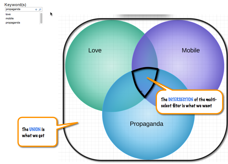
A Series of Calculations
To get there, Jonathan taught me to think in terms of logical building block calculations:
# Keywords for Session
Of the various keywords chosen, how many of those exist for each conference session?

# Keywords Selected
In total, how many keywords have been chosen in the quick-filter?
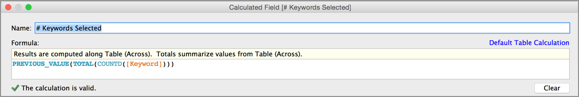
I've wrapped the total calculation in a PREVIOUS_VALUE() wrapper to improve performance. From number 10 in , this works because all rows will print the value from a single computation.
(PS - though, if I'm not mistaken, I understand now that TOTAL() behaves differently from most other table calcs & is computed only once, anyway :)
Keyword Intersection Filter
Now comes the good stuff. When filtering for the intersection, we only want conference sessions for which the
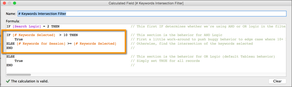
AND / OR
A parameter decides whether to use AND vs. OR logic. And there's a bit of an edge-case workaround, to help the intersection logic behave correctly when none of the conference sessions contain all of the keywords you're searching for.
That part about working around the edge-case is described in detail with my to our forum conversation.
The Finder Concept
In addition to highlighting the intersection logic, I really hope this post helps to illuminate the useful concept of a finder dashboard.
In short, a series of quick filters can help you to "find" the widgets you're searching for. And then, from that reduced list which match your criteria, the dashboard filter actions then bring other sheets into view.
What's More
This dashboard also gave me a chance to incorporate some Sheet Popping, which is explained very nicely by Joe Oppelt, Matthew Lutton, and Ville Tyrväinen in .
So Why Wait ?
Not long now 'til TC15. Might I suggest we all commit to watching every session from TC14-TV before departing for , Las Vegas in October ?
Word Count: 511
References
"Tableau Conference Television", Keith Helfrich, Redheaded Step Data, November 17, 2014
http://redheadedstepdata.io/tableau-conference-television"About The Conference", TC14, Tableau, April 29, 2014
"Fantastic News", Tweet by Pam Gidwani, Twitter.com, April 20, 2015 11:43 AM
Jonathan Drummey, Data Blog, Drawing with Numbers, April 29, 2015
"Brainstorming Multi-Select Filters: INTERSECTION instead of UNION", Tableau Community Forums, Keith Helfrich and Jonathan Drummey, June 3, 2014
Sheet Swapping and Popping with Joe Oppelt (and a Tip on Searching the Tableau Forums), Matthew Lutton, Joe Oppelt, Ville Tyrväinen, October 4, 2014
"Tableau Conference 2015", Tableau Software, Tableau.com, April 29, 2015
This post describes an approach to ensure you get the best possible response from Tableau Support, with the fastest possible turn-around time.
Context
After years of working on Enterprise systems I've found that, when I have a problem, the best solution is to solve it myself.
If I cannot solve it myself, then the problem is significant, and I want a valuable answer as quickly as possible.
Problem Definition
Tableau is a complex piece of software. Communication challenges can be among the largest of the hurdles to overcome when working through an issue.
The free text entry box allows unformatted text: no headers, no images. Worse: if my plain text is structured poorly, the Support Engineer may have no choice but to waste valuable time asking me questions.
My Solution
In each new support request, my free text contains one sentence. And there are two attachments.
Dear Tableau Support,
Please review the attached PDF and packaged workbook.
Thanks!
Keith Helfrich
(415) 400-6640
The PDF
The PDF is a no frills document, which follows a logical structure.
Descriptive text is augmented with screen shots that are marked up with arrows & call-outs.
Not each of these sections is required for every request. Often, only a sentence or two is needed in each section, to produce a cohesive and logical flow. The idea is to concisely frame your issue.
You will know, depending on the issue, which sections to include.
Title: One sentence. The short description of what we're dealing with.
Context: A high level description of the data & context in which the workbook is intended to operate.
Objective: The end goal, what I'm trying to accomplish.
These above two sections I include because, often, the Tableau Support Engineers can offer an alternative approach that I've not yet considered.
Problem Definition: The specific definition of the precise issue for which this support request has been opened.
This section is always present & laser focused. If I cannot define the problem, then I cannot expect an answer.
Steps to reproduce the issue: Sequentially numbered steps, with supporting screenshots & detail, to articulate exactly how to reproduce the issue.
Supporting Detail: Any additional information, as required.
Questions for Tableau Support: Based on all of the above, these are my numerated questions that I would request to be answered.
These questions often go beyond the scope of the problem to make inquiries that are further afield. It never hurts to ask.
Since I've gone to such effort to save everyone valuable time, the Support Engineers will almost always go the extra mile to help me with answers to all of my questions when they're able.
Version Details: The version of Tableau Server that I'm publishing to. Screenshots of the version info from both my Operating System and Tableau Desktop.
So easy to include! So easy to save two days of wasted time by not forcing them to ask.
Thank You! and my phone number.
I make absolutely certain the human on the other end of the line, with human feelings, knows they are appreciated. And that they can pick up the phone to call me if they want to.
Show Me the Money
So what's in it for me? The benefits of taking this organized & consistent approach are numerous:
Just producing the PDF will very frequently lead me to answer my own question.
First tier support can almost always escalate or resolve immediately. No back & forth required.
Here I've saved at least two days!
The 2nd tier support person can immediately reproduce the issue.
Here I've saved another day!
Reciprocity. By now I'm a customer who the Support Engineers want to help.
They recognize my standard for quality. They see I've done my homework. And they respond by going the extra mile to reciprocate & add extra value to their own reply.
Miscellaneous Tid-Bits
On My Hard Drive
In a single location I keep a separate folder for each new support request.
Each folder is named <ticket number> - <short description>. It contains the PDF, the packaged workbook, and any other attachments (like zipped up log files).
Naming folders with the ticket number ensures they will sort in chronological order. And it helps in the future when I need to refer back to an earlier request by name & number.
To Produce the PDFs
My personal approach is to compose them in Evernote, with tags so I can find them later. And then I print to a PDF file.
For the screenshots, I'm a lifetime user of SnagIt. I can easily capture the portion of the screen I'm interested in, and mark-up the capture with arrows & callouts.
As a Result
I frequently solve my own problem. This is the fastest answer possible.
If I don't solve my problem, then I very well define it.
Doing so consistently gets me an answer that is more valuable, with a turn-around that is ~three days faster than it would have been otherwise.
Word Count: 836
]]>
This post provides an overview and various methods converting dates between time zones, with examples and considerations for Daylight Savings time.
Having , I was curious to observe that, apparently, the optimal time for me to send tweets is on Mondays at around 2am. But wait. I don't send tweets while I'm sleeping. So, how can this be?
It's because the Twitter Analytics time stamps are stored in UTC.
Store Universally, Display Locally
As a best practice, one should store data in as constistent & portable a format as possible. For date & time values, that format is Coordinated Universal Time.
So we should store our data in UTC and convert it into the local time zone for display. But conversion is tricky: offsetting the hour is easy. It's daylight savings that you need to consider.
Governments the world over are constantly tinkering with daylight savings. Not only national laws, but also state, provencial, and local municipality laws are each constantly changing.
The country of Argentina, for a personal example, attempted twice during my seven years living in Buenos Aires to switch to daylight savings. They failed both times, reverting back mid-change. This resulted in unplanned adjustments to the clock hour, and multiple software updates released world-wide to actualize the relationship between time zones.
Below are three demonstrations of how you might approach time zone conversion, prior to performing your visual analysis in Tableau.
1. As Part of ETL Processing
Since I was pre-processing my Twitter Analytics data anyway, the most sensible approach for me was to leverage the sophistication of R. I've thus gone back now to and insert the equivalent of these two new lines of code:
# time zone conversion
twit_data$LocalTime <- as.posixct(twit_data$time,tz="GMT" )="" twit_data$localtime="" <-="" format(twit_data$localtime,="" tz="US/Pacific" ,usetz="FALSE)" <="" code="">
Notice that R is a vectorized language. The entire vector of values is converted in a single command. No loops required. Also note: I'm saving the converted values into a new column, named LocalTime, thus preserving the original UTC values.
Revolution Analytics covers a variety of important considerations when converting time zones in R:
2. As a Calculated Field in Tableau
Another option is to calculate the offset hours in Tableau. Dave has . His calculation in Tableau converts the time zone from UTC to EST, with a daylight savings adjustment, for any date between the years 2010 and 2020.
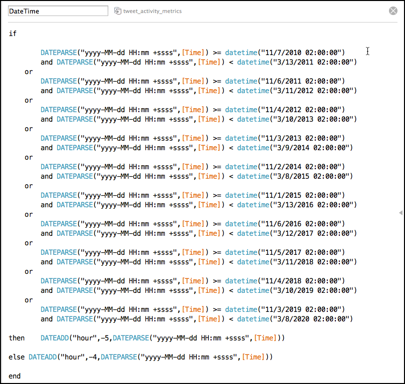
This approach is OK for an informal analysis, but is too brittle for a production grade application. That's because the calculation can break under a variety of very plausible situations:
- any date earlier than the year 2010
- any date after the year 2020
- and any dates inside of the range, should the rules governing daylight savings happen to change
This type of brittle rigidity should be actively avoided in your production data pipelines & code. As an example of what can go wrong (and a harbinger of interesting times to come), this medium post is a fascinating read:
For those various ‘less formal' dashboards in which it is an option, I will sometimes take this parameter based approach below.
First, check how the parameter is used within the dashboard. Basically, two times per year, the publisher will republish. This time with the parameter set in a new position. Or, the consumer can always change the parameter in real time if they have to:
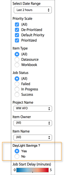
This is what the parameter looks like:
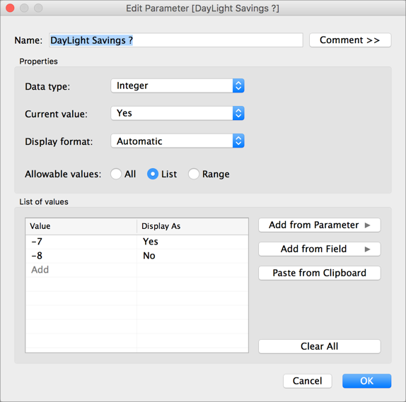
And the calculation simply decides which date math to do, based on the parameter:

The parameter values of -7 and -8 above are for converting from UTC into PST.
While the parameter does need to be changed manually twice per year, this is simple and flexible and transparent approach. The user has control & there's nothing complicated that can break or cause confusion about how the system works.
3. At the Database Layer
A third option for converting time zones is to leverage the database itself. In his custom server admin views, Tableau Zen Master Mark Jackson leverages the postgres database to convert the Tableau repository timestamps from UTC into EST using Custom SQL:
SELECT "historical_events"."created_at" AT TIME ZONE 'EST' AS "created_at (EST)"
Additionally, Pass-Thru SQL can also leverage the database. The Pass-Thru approach may, in many cases, be more appropriate than custom SQL in the data connection. This is because custom SQL data sources often involve trade-offs (for example, from a performance perspective, custom SQL data sources cannot benefit from join culling). Thanks to Joe Mako for highlighting the Pass-Thru option!
In Summary
One must be very careful when converting dates & times. The conversion can occur at any layer in your stack:
- in the Database
- as a part of ETL
- in Tableau
Daylight savings rules are ever changing. Brittle calculations are best avoided. Date and time conversions in a production pipeline should patch dynamically when world's details change.
Also, keep an eye on Tableau. In the future, it will only make sense for them to begin to perform these daylight savingsaware conversions directly within their software.
And as it turns out, the optimal time for my tweets is now apparently on Sundays, at around 6pm.
Word Count: 732
References
- "Leverage Dave's Twitter Analytics", Keith Helfrich, Red Headed Step Data, February 12, 2015
- "Coordinated Universal Time", Wikipedia.org, February 21, 2015
- "Converting time zones in R: tips, tricks and pitfalls", David Smith, Revolution Analytics, June 02, 2009
- "Twitter Analytics Dashboard", Dave Andrade, Tableau Public, February 19, 2015
- "Custom Tableau Server Admin Views", Mark Jackson, Tableau Zen, August 13, 2014
This post provides fast & easy steps for leveraging to make it your own. There's a bit of R code, and a repeatable process to update your view with new data as often as you like.
"Stealing like an Artist" is a widely accepted within the Tableau Community. So much so.. the Tableau Public Blog has a post by Hanne Løvik with instructions for how to reverse engineer a dashboard:
Just finishing a bit of burglary myself, I figure the best way to repay the community is to publish my steps. Now you can steal a little bit from both of us.
Let's Make This Quick
1. Download Dave's Workbook
Use the fancy new toolbar on the , and pull Dave's dashboard down to your hard drive.
2. Grab Your Data
From , you could get all the available data at once. But our goal is to build a repeatible pipeline. So let's begin that process now. Download one month at a time, each month to a separate CSV file.
3. Row Bind These Files Together
Here's a screenshot of my directory structure:
You can see that I am following a similar process for incoming data from other sources, as well, such as Google Analytics, SumAll, AddThis, etc.
My choice is to use R for the processing. You can use whatever tool you like. To simply leverage what I've done, set yourself up as follows:
- ../data files/twitter-analytics
- the monthly CSV exports
- ../data files/_tidy
- tidy output
# Twitter Analytics
# Export one data file per month, using default file name with a datestamp
tidy_twitter <- 2009="" 15527720="" function()="" {="" #="" global="" variables="" base_dir="" <<-="" "="" path="" to="" your="" data="" files="" tidy_dir="" paste(base_dir,"_tidy="" ",="" sep="" )="" ##="" set="" local="" time="" zone="" carefully,="" for="" use="" with="" format(as.posixct)="" http:="" blog.revolutionanalytics.com="" 06="" converting-time-zones.html="" local\_time\_zone="" "us="" pacific"="" locations="" &="" twit_dir="" <-="" paste(base_dir,"twitter-analytics",="" raw="" directory="" twit_files="" list.files(path="twit_dir," all.files="FALSE,full.names=TRUE" list="" read="" stackoverflow.com="" questions="" import-and-rbind-multiple-csv-files-with-common-name-in-r="" twit_data="" do.call(rbind,="" lapply(twit_files,="" read.table,="" header="TRUE," ))="" rbind="" pretty="" names="" names(twit_data)="" gsub("\\.",="" names(twit_data))="" replace="" .="" de-dupe="" (in="" case="" were="" downloaded="" overlapping="" dates)="" unique(twit_data)="" conversion="" twit_data$localtime="" as.posixct(twit_data$time,tz="GMT" format(twit_data$localtime,="" tz="local_time_zone,usetz=FALSE)" write="" csv="" twit_outfile="" paste(tidy_dir,"twitter-analytics.csv",sep="" write.csv(twit_data,twit_outfile,row.names="FALSE)" }="" tidy_twitter()="" <="" code="">
4. Replace the Data Source
- Open Dave's workbook in Tableau
- Create a new data source from your your combined CSV data
- Copy & Paste the DateTime calculation from Dave's data source into your own
- with your own
- Close the original data source
- Save the workbook
5. Now, as often as you like:
Download a new CSV, run your R script and analyze your tweets!
My script will row bind together all of the files in your data directory (regardless of their name or how many there are).
And there's a line of code to remove duplicate records, just in case you download multiple files with overlapping date ranges.
Thanks, Dave. The dashboard is excellent!
Word Count: 491
References
- "Twitter Analytics Dashboard", Dave Andrade, Tableau Public, February 10, 2015
- "How to Steal from the Best", Hanne Løvik, Tableau Public Blog, January 21, 2015
- "What's New? Pretty Much Everything", Jason Gorfine, Tableau Public Blog, February 9, 2015
- "Replacing a Data Source", Tableau Knowledge Base, October 7, 2014
- “It’s not where you take things from – it’s where you take them to”, Devita Villanueva, Perpetual Evolution, April 27, 2013
Stumped by a blending problem where the column total for a blended calculation was zero, I called on my friend Joe Mako.
Exceptionally generous with his time & knowledge, Joe helped me to understand: what at first had seemed to be a simple confusion was actually various roadblocks in Tableau that each require some effort to understand & work around.
Summarizing the knowledge I received from Joe, I'd like to thank him again for his generosity! All of the packaged workbooks are attached to my forum question, which is here:
Think of Totals as a ~Separate Sheet
The first bit of insight is that column totals can generally be thought of as a semi~separate worksheet. This is especially true for automatic totals.
In many ways, automatic column totals behave like a TOTAL() calculation. That is, they are performed on the server (inside of the data source). And as a result, they explicitly ignore the dimensions on the rows shelf of your worksheet.
This is an important concept, one that plays into the solution and one that Curtis Harris has also hinted at with his clever method for improving the grand totals on a bar chart.
Notice how Jim Wahl's comment at the bottom of that post also speaks to the very same details we're discussing here:
The other way determine if you're on the grand total row is IF MIN(Category) <> MAX(Category) THEN SUM(Sales) END.
This works because Tableau removes the Category dimension when calculating the grand total.
I think I like your approach of using SIZE() = 1 better, because I can change the dimensions without changing the calc.
Nice tip.
Jim
Crux of the Issue
So, the "automatic" column totals are computed on the server (inside of the data source), and they ignore the dimesions on the rows shelf. What's required then is a different type of column total, one that computes locally & takes those dimensions into consideration (similar to a table calculation).
Enter Total Using
In fact, Tableau has partially implemented this feature already, it's called Total Using. Here is a quick look at how it works:
For more on Total Using, see and .
That's great. But as we'll see, the crux of my problem was that "Total Using" isn't always available. Joe me showed two reasons why, because I had managed to stumble upon both of them.
1. Calcs Using ATTR
Before we even get into data blending, the first reason why Total Using can be unavailable happens within a single data source. It's simply because the calculation involves an .
Just to show you what I'm talking about, in the screenshot below I've simplified the calculation to only use values from the primary data source. As you can see, by manually imposing the same logic as an ATTR, IF MIN() = MAX(), the ability to "Total Locally" "Using SUM" magically becomes available. And the column total works correctly when we do.
In the calc that uses ATTR(), the only option available for "Total Using" is "Automatic". And there's no love from the automatic column total.
2. Calcs Across the Blend
But my calculation really does need a value from the secondary data source. And this "calculating across the blend" failure is the real reason why my column total was zero. Total Using isn't available for pills that compute across the data blend.
These are complex pieces of code from the Tableau engineers, and technical challenges likely exist. But from an end user perspective these limitations seem arbitrary.
A work around is possible, but it's also rather painful (see below). So it would be best if Tableau can extend the current implementation of Total Using to completion. A column grand total should be easy, especially in an Enterprise business world that grew up on Excel.
Forced to Automatic
OK! So here is the reason why my blended boolean column totals were zero:
Since the pill being totaled computes across the blend, the column grand total is forced into an "Automatic" Total Using. And the "Automatic" Total Using behaves much like a regular old TOTAL() computation, which performs inside of the data source and as a result it ignores the dimensions that partition the rows.
Since my linking field to the secondary data source just happens to be one of those dimensions on the rows of the canvas that is being ignored, the "semi~extra sheet" that computes the column total is literally ignoring the linking field for the blend! No wonder things break down.
Solution Set-up
The setup for the workaround then is to find a way to prevent the column total from ignoring the linking field for the blend. Joe's answer: link the blend on a completely separate field.
Merely duplicating the existing pill is not enough. We need a completely separate pill, but one that utilizes the same calculation.
As you can see below, this is only as easy as 1-2-3-4. Some other breakable things get messed up and also need to be fixed along the way.
- We blend on a twin of the linking field, which allows for the automatic column total to avoid ignoring the blend
- But doing so wreaks havoc in the total by "overlapping values"
- To fix this, an IF FIRST() = 0 THEN WINDOW_SUM([AGGREGATION]) END, which computes along the new linking pill to take advantage of the blend, will prevent the overlapping
- This is effectively the same as Tableau's Total Using
- For example: replacing the WINDOW_SUM with WINDOW_AVG accomplishes the same thing that Total Using "Average" would
- And moreover, the variety of WINDOW_AGGREGATION table calcs available offer many more aggregation options than Total Using currently does (such as median, count, percentile, standard deviation, variance, etc).
- Use an Alias to beautify the now terrible column header
The Final Solution
Assuming these column totals are truly so important for what you're trying to do that you must have them, then the final solution is to do all of the above & create an IF FIRST() == 0 THEN WINDOW_SUM([AGGREGATION]) pill for every measure of your crosstab. This prevents the overlapping text for each of them. But it also messes up the column headers, and to fix those you must right-click on the header to add an alias.
In Summary
Thanks to Joe! It's really nice to understand the inner workings of these cross blend problems. Understanding what's going on "under the hood" is the best way to flow with Tableau and avoid getting frustrated.
But at the same time, wouldn't it also be nice if the Tableau engineers would build out the rest of the Total Using functionality? Shouldn't everything just work as expected, even across the data blend?
Along those lines, Jonathan Drummey has an idea:
Thanks again, Joe!
Word Count: 1,150
References
- "Blended Boolean Column Totals are Not What They Seem", Tableau Community Forum Question, January 18, 2015
- "Tableau Quick Tricks - Building A Better Bar Chart", Curtis Harris, curtisharris.weebly.com, January 5, 2015
1."Computing Totals", Tableau Software Quick Start Feature Guides, January 23, 2015
- "Configuring Grand Totals", Tableau Software Online Help, January 23, 2015
- "ATTR() - Tableau's Attribute Function Explained", Tim Costello, Interworks Blog, May 15, 2014
- "Total Using across the data blend", Keith Helfrich, Tableau Community Forum Ideas, January 23, 2015